Soviet political and advertising posters of the 1920s—from Constructivism to Photomontage
Research Concept
This visual study is dedicated to the transformation of Soviet poster language in the 1920s—a period when political mandate and artistic experimentation merged into a single visual project that would define the look of Soviet graphics for decades to come. The focus is on the works of Alexander Rodchenko, Vladimir Mayakovsky, Gustav Klutsis, and El Lissitzky, whose experiments with geometric composition, typography, and photomontage shaped what is now called the «Soviet style» in global design. The selection of these four artists was not arbitrary: each represents a specific trajectory in the development of poster language—from Lissitzky’s suprematist abstraction to the advertising typography of Rodchenko and Mayakovsky, and to the political photomontage of Klutsis—and together, they allow for a volumetric understanding of the phenomenon under investigation, rather than viewing it through the prism of a single artistic method.
The relevance of this research stems from the dual status of the Constructivist poster: on one hand, it is one of Russia’s most recognizable visual brands, reproduced widely in contemporary design, fashion, and mass culture; on the other hand, its ideological function and artistic techniques are often treated as isolated from one another. Researchers either analyze the formal experiments of the Constructivists divorced from their agitational purpose or, conversely, reduce the poster to an illustration of political slogans, ignoring its graphic ingenuity. The goal of this work is to bridge this gap and demonstrate exactly how technical solutions (diagonal lines, perspective, photomontage, color contrast, large-scale typography) served as tools for political and commercial impact, and where the boundary lies between art and propaganda. This approach allows us to see the posters of the 1920s not as a collection of disparate masterpieces, but as a cohesive visual system possessing its own rules, logic of development, and internal contradictions.
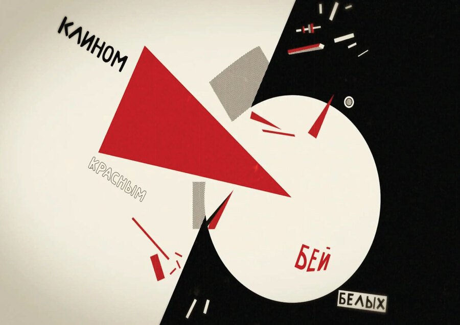
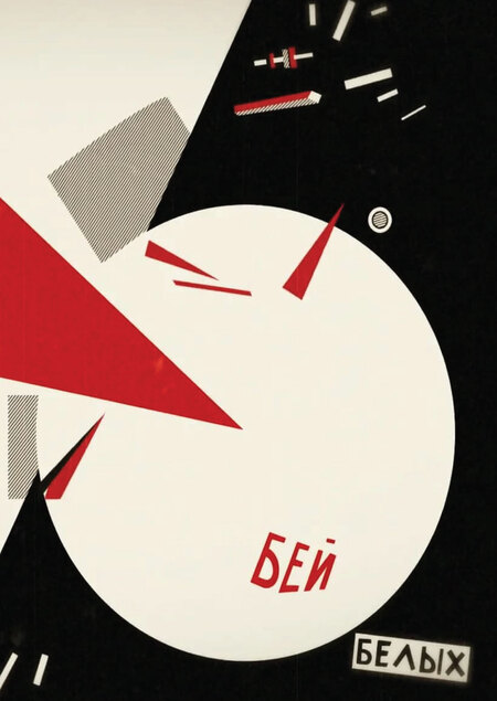
«Reds Against Whites» El Lissitzky 1919–1920
Particular attention should be given to the question of the boundaries of the period under investigation. The upper limit—1919–1920—is marked by the appearance of Lisitsky’s «Cline, ” the first work in which abstract geometry is systematically subordinated to a political message. The lower limit—1925—is connected to the establishment of photomontage as a dominant technique and the appearance of posters on the international stage (Paris Exhibition of 1925). Subsequent history—the resolution of the Central Committee of the VKP (b) „On Poster Literature“ in 1931 and the affirmation of the socialist realist canon—falls outside the scope of this study because it signifies not an evolution, but a break in the Constructivist tradition. It is this deliberate limitation of the chronological framework that allows a focus on the internal logic of the phenomenon, without mixing it with subsequent ideological revisions.
Therefore, the research is built upon the intersection of three perspectives: the art-historical (the evolution of formal techniques), the functional (the poster as a tool of influence), and the comparative (political and commercial graphics as parallel lines). Each of these perspectives is realized in a separate section of the work, while the summary section brings them together into a single picture.
The key research question
Can political and advertising posters from the 1920s be considered a unified field of visual experimentation, where genres differ in content but not in method?
Hypothesis
The visual language of Soviet posters from the 1920s evolved along the trajectory of increasing functional universalization: techniques developed in advertising and book posters (typography, photo-montage, geometric grid) were transferred to political posters and vice versa. To test this hypothesis—by comparing works of different genres created by the same authors during the same period or within the same associations.
Material Selection Principle
The study includes posters that meet three criteria simultaneously: (1) they were created between 1919 and 1925—ranging from Lissitzky’s Suprematist experiments to the establishment of photomontage as a dominant technique; (2) they belong to the programmatic group, meaning they either manifest a new method (such as «Beat the Whites with the Red Wedge») or reproduce it in mass production (like the posters of the Main Directorate of Public Education); and (3) they have been preserved in museum collections or archival holdings as an original or a high-quality reproduction suitable for visual analysis. The material is deliberately limited to the 1920s: following the Central Committee of the All-Union Communist Party (Bolsheviks) decree «On Poster Literature» in 1931, the Constructivist experiment was interrupted, and including later works would blur the boundaries of the phenomenon under investigation.
Research Outline
Block I. Origins: Suprematist geometry as the foundation of poster language (1919–1920) — Lissitzky, two versions of «The Wedge.»
Block II. The «Advertising Constructor»: Rodchenko and Mayakovsky, advertising poster (1923–1925) — Mosselprom, «Young Guard.»
Block III. Book Poster and the Birth of Photo-Montage (1924–1925) — «Lengiz» with Lilia Brick.
Block IV. Political Photo-Montage: Klutsis, Leizerov, and «The Leninist Call» (1924) — Leizerov, Klutsis.
Block V. Poster Analysis: Deconstructing specific works based on formal criteria — a detailed visual analysis of key sheets.
The blocks are structured based on three axes: chronological (from early experiments to mature photo-montage), authorship (Lissitzky — Rodchenko/Mayakovsky — Klutsis/Leizerov), and function (advertising, book, political poster).
Module I. Origins: Suprematist Geometry as the Foundation of Poster Language (1919–1920)
This section opens an investigation and serves as a foundation: it demonstrates that the Constructivist poster did not arise in a vacuum but evolved from the Suprematist tradition, where abstract geometry was conceived not as decoration, but as a means of political communication. Central to this is El Lissitzky’s work, «Red Wedge Beating White"—a poster widely considered the starting point of the Constructivist poster language. The section includes two versions of the same composition, allowing viewers to see how the artist works with print runs and format: the same geometric motif is varied and repeated, transforming from a singular experiment into a reproducible formula.
«Red Wedge Against White» El Lissitzky 1919–1920
The red triangle piercing the white circle is a geometric metaphor for revolutionary violence, stripped of narrative details. The slogan text is embedded within the page space as a graphic element, rather than as a caption. The poster was first printed using lithography in 1920.
«Beat the whites with a red wedge» El Lissitzky. (Variant, 1920)
The second version of the composition, allowing one to trace how the same geometric motif varies and is reproduced.
The relationship between abstract form and political meaning is resolved through color here: red, white, and black function as an ideological code, not merely as a decorative palette. Typography is integrated into the composition as an equal element—the slogan does not label the image; it is embedded within its geometry. It is in this block that the thesis is established for later verification: the poster begins as a construct, not as a painting. Comparing the two versions of «Kline» shows that the conceptual approach is considered replicable from the initial stage—and therefore, potentially suitable for mass reproduction across any genre.
Block II. «Advertising Toolkit»: Rodchenko and Mayakovsky, advertising poster (1923–1925)
The second block moves the research from the realm of Suprematist experiment into the sphere of mass commercial advertising. It demonstrates how the principles developed in Lisitsky’s posters were adapted by Rodchenko and Mayakovsky for the needs of Mosselprom and book publishing, acquiring a serial, almost industrial character. The block is built around the concept of the «constructor advertisement"—one compositional scheme is varied for different products and slogans, and this serialization is not repetition, but rather proof of the technique’s universality. The material in this section reveals how the diagonal, typographic rhythm, and the geometricization of the image became a universal language suitable for any task—from selling candy to political agitation.
Advertising posters: «Rubber Booties of Rezinrest—Simply Ecstasy. Worn in the North, West, South, and East,» and «Rezinrest—Protector in Rain and Slush. Without rubber booties, in Europe—sit and cry,» Advertising poster «There was no better nipple, and there is none,» 1923
A. Rodchenko, V. Mayakovsky. A series of posters for Mosselprom («Mosselprom, ” „Rezinotrest, ” „Gosizdat, ” and others, 1923–1924)—a collection of works that demonstrates the systematic nature of their method: a single compositional scheme is adapted for various products and slogans.
Diagonal composition, typological rhythm, and the geometric rendering of the image work here to solve a dual problem: capturing attention and conveying a message. The ratio between the commercial and political messages is telling: the same formal apparatus serves different functions, which confirms the hypothesis of the functional universalization of language.
«The advertising kit”—this is not about reducing art to mere commerce, but about expanding the scope of its application; it is in advertising that the technique is tested for mass appeal
and reproducibility before being transferred to a political poster.
Block III. The Book Poster and the Birth of Photomontage (1924–1925)
The third section documents the moment when drawn graphics give way to photomontage, illustrating how book advertising became a proving ground for this technique. The central piece in this section is Rodchenko’s poster, «Lengiz. Books of All Fields of Knowledge,» for which the artist created a series of photographic portraits of Lily Brik. Here, photography is integrated into the poster not merely as an illustration, but as a document: it introduces an effect of «factual truth» while simultaneously allowing the artist to treat the human face and gaze as a compositional element. The section demonstrates how a technique developed in book advertising immediately proves viable for political posters—which sets the stage for the next section.
A. Rodchenko. «Lengiz. Books for All Fields of Knowledge» (1924–1925)
Key work of the block. For this poster, Rodchenko created a series of photographic portraits of Lily Brik; the poster depicts Brik dressed as a worker in a kerchief, appealing directly to the viewer with a call to purchase books from Gosizdat. The composition is built on a diagonal, where a large photographic fragment combines with geometric color fields and a concise slogan. In 1925, the poster was presented at the International Exhibition of Modern Decorative and Industrial Arts in Paris.
The technique of photomontage and its effect—documentarity, the «truth of fact”—are examined as subjects of visual analysis here for the first time. The role of the human face and gaze is particularly important: Brick looks directly at the viewer, and this direct gaze transforms the advertisement into a personal address. The combination of photography and geometric abstraction on a single page demonstrates that two languages—the documentary and the geometric—do not conflict but complement each other. This is precisely where the study’s hypothesis receives its first direct confirmation: the technique developed in book advertising immediately proves viable for political posters.