Navigation Menu
- Concept
- The Modernist Era and Visible Function
- The Turning Point: The Arrival of Postmodernism
- The Computer as Sculpture
- The Haptic Cost of Visual Purity
- Conclusion
Concept
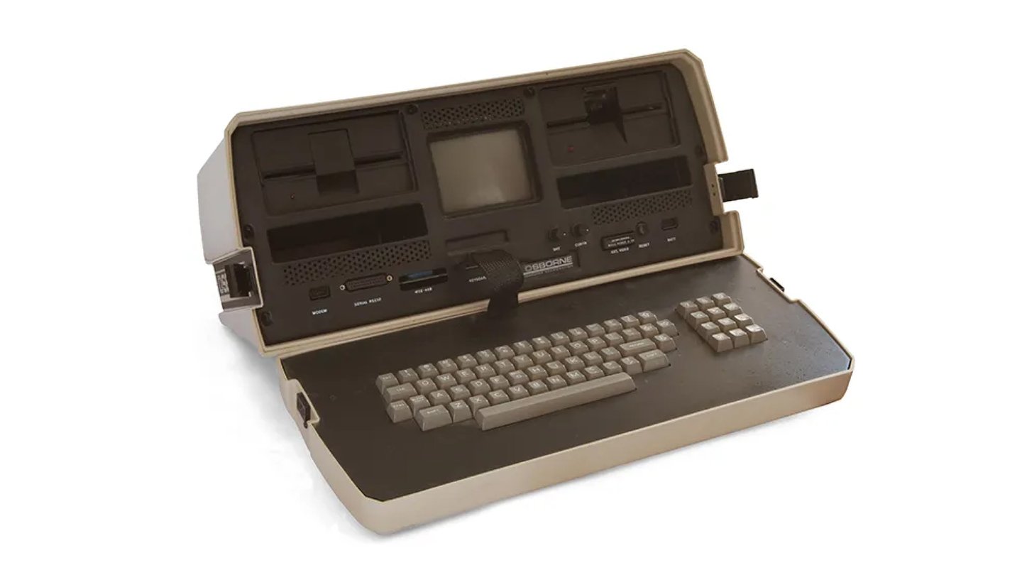
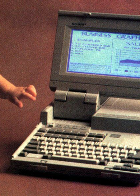
Osborne 1, the world’s first portable PC, 1981.
The subject of this visual study is the transformation of Apple personal computer industrial design: from a strictly functional device to an aesthetically expressive consumer object. The computer is one of the most illustrative items of the digital age—it has changed not only how we work and communicate but also the visual landscape of the home, the office, and popular culture.In the late 1970s and 1980s, the computer was perceived as a utilitarian «box.» Its casing was restrained, predominantly beige or gray, and its form adhered to the logic of production and cooling. The Apple II (1977) was conceived as a home device and received the Pantone 453 beige casing to fit into everyday life. However, its image remained primarily tied to function rather than artistic expression.
Apple II 1977 Advertisement
The iMac G3 (1998) marked a turning point. Its translucent colored casing, rounded forms, and «friendly» aesthetic transformed the computer into an object of desire and a stylish interior piece. Jony Ive’s design made aesthetics the central element of consumer value—the machine became not just a tool, but a signifier of taste, status, and cultural belonging.
The relevance of this topic is determined by the fact that this logic remains true today. A user selects a technique not only based on its characteristics but also on its silhouette, materials, color, and its ability to fit into their personal style. Visual expressiveness becomes a value in its own right, but it often conflicts with ergonomics, repairability, and tactile comfort.
Advertisement for the new Macintosh model, 1984.
The research is structured chronologically and thematically. The work is divided into four blocks. The first is dedicated to modernism and the principle of «form follows function»: early PCs, their open architecture, and the priority of engineering rationality. The second explores the shift associated with postmodernism: irony, playfulness, decorative elements, the influence of the Memphis Group, and the emergence of the iMac G3 as the first mass-market «friendly» computer. The third examines the computer as a sculptural object—the iMac G3, the Power Mac G4 Cube, and the 2013 Mac Pro—where the casing transforms into a facade, and the internal components become an element of the artistic form. The fourth block is devoted to the «sacrifice of tactility»: the Apple Pro Mouse, Touch Bar, and Magic Mouse as examples of abandoning physical anchors in favor of smooth surfaces and visual purity.
Research Hypothesis: The transition of the computer from a functional «box» to a sculptural object resulted from the influence of postmodernist ideas on industrial design.
Postmodernism changed not only the visual language of technology but also the perception of an object’s value—the computer began to be seen as a signifier of style, status, and cultural identity.
As a result, designers began consciously sacrificing tactile comfort, ergonomics, and practicality in pursuit of visual purity and a recognizable aesthetic.
The Age of Modernism and Visible Function
In the first few decades, the personal computer evolved according to the logic of modernism: form must follow function. The principle of «form follows function» meant that the computer was designed as a working tool—the casing protected the electronics, provided access to ports, and dissipated heat. Aesthetics remained subservient to engineering rationality: the computer looked like machinery, not like an object for interior decoration.
Early PCs were open circuit boards housed in metal or wooden casings and required technical expertise. The Apple II (1977) represented a step toward a finished consumer device: a unified plastic enclosure and built-in keyboard. However, it still embodied the aesthetics of a functional machine—light beige plastic (Pantone 453, spearheaded by Jobs), a simple rectangular form. The beige color was perceived as neutral, «office-appropriate.» Later, the phrase «boring beige box» became shorthand for the computer aesthetics of the 1980s through the early 1990s.
The IBM PC (1981) solidified this design language: a rigid chassis, a gray-beige palette, and large keys. The computer did not hide its technical nature—it openly displayed itself as a complex machine for work.
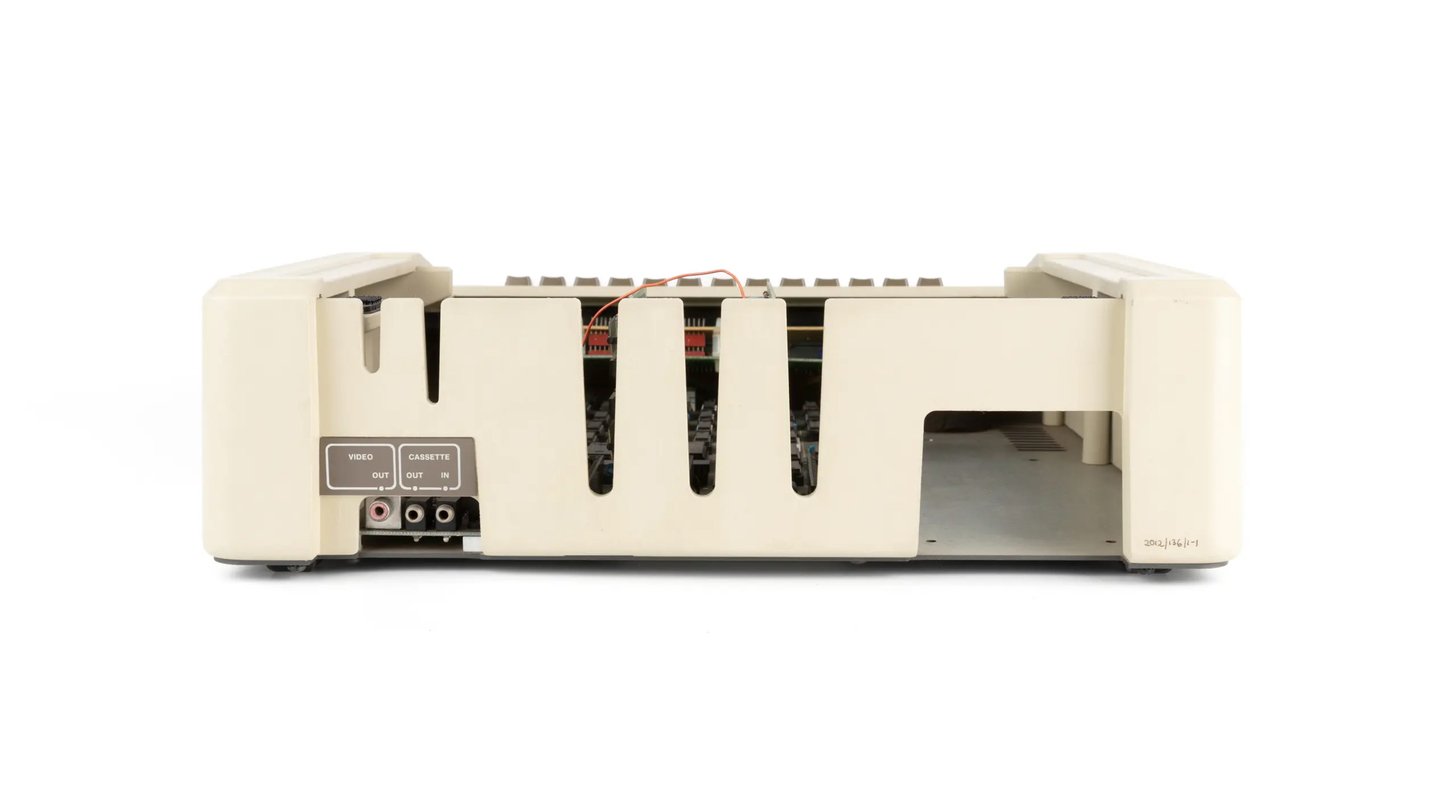
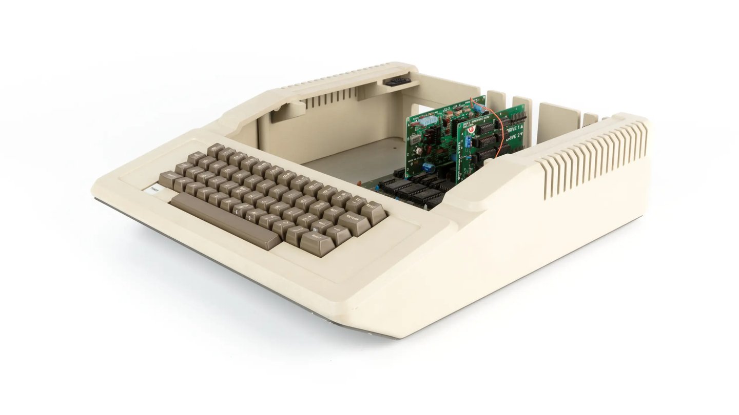
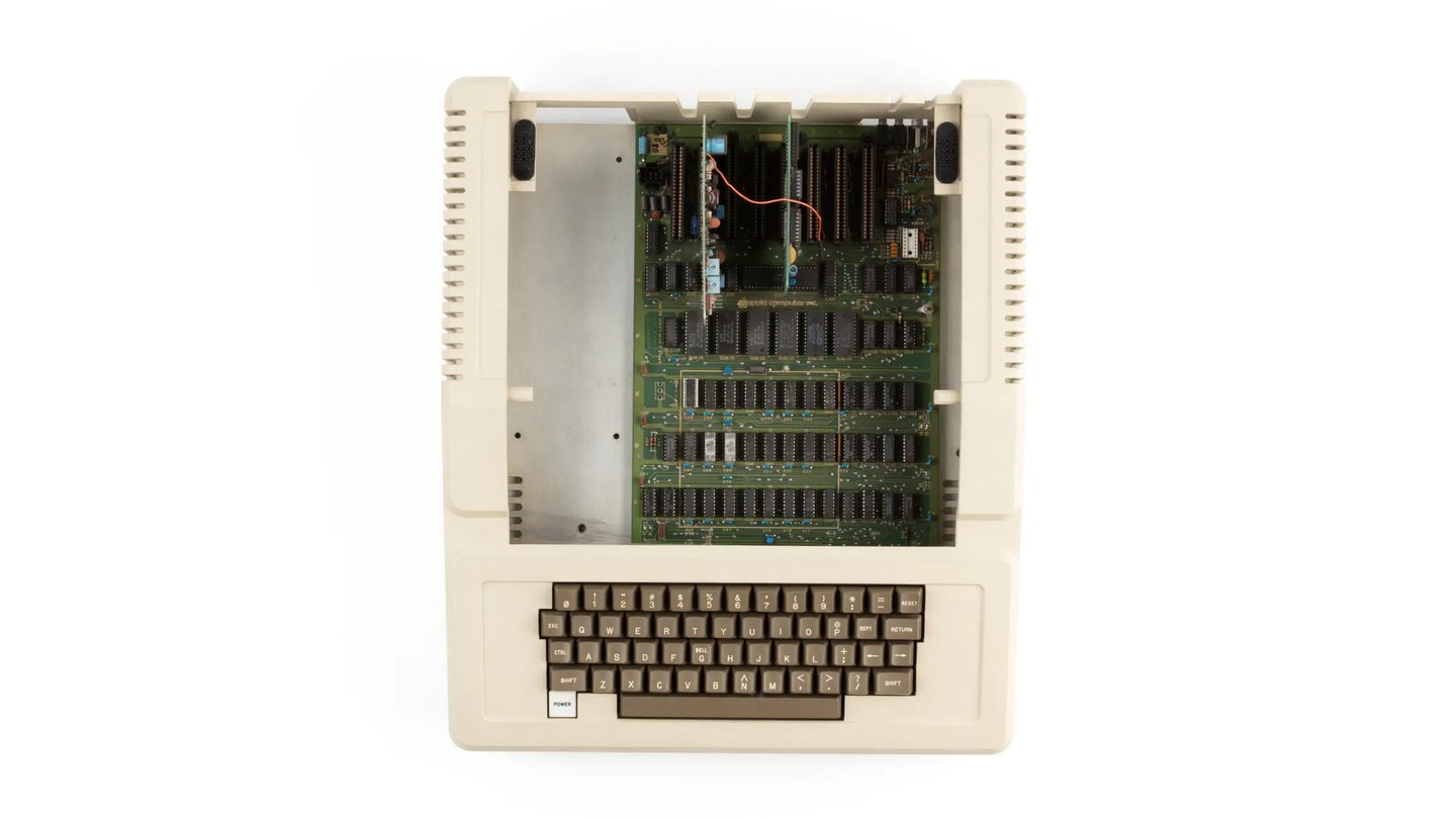
Apple II Computer by Steve Wozniak and Jerry Manock, 1977–1982
A characteristic feature of early personal computers was the open display of functionality: buttons, indicators, ports, disk drives, and ventilation grilles were not concealed. The Apple II featured eight expansion slots, a removable casing, and modification capabilities—the computer was designed as an open system, not a sealed «black box.» The ports, cables, and ventilation created a sense of structural honesty; the user could see how the machine was built.
IBM PC 5150, full configuration with printer, 1981
Industrial design was merged with engineering: decisions were based on component placement, cooling, assembly, and serviceability. Even the plastic casing of the Apple II was designed to make the computer accessible to the mass market. Aesthetics did not create an autonomous image; rather, it helped present a functional machine as a familiar household object.
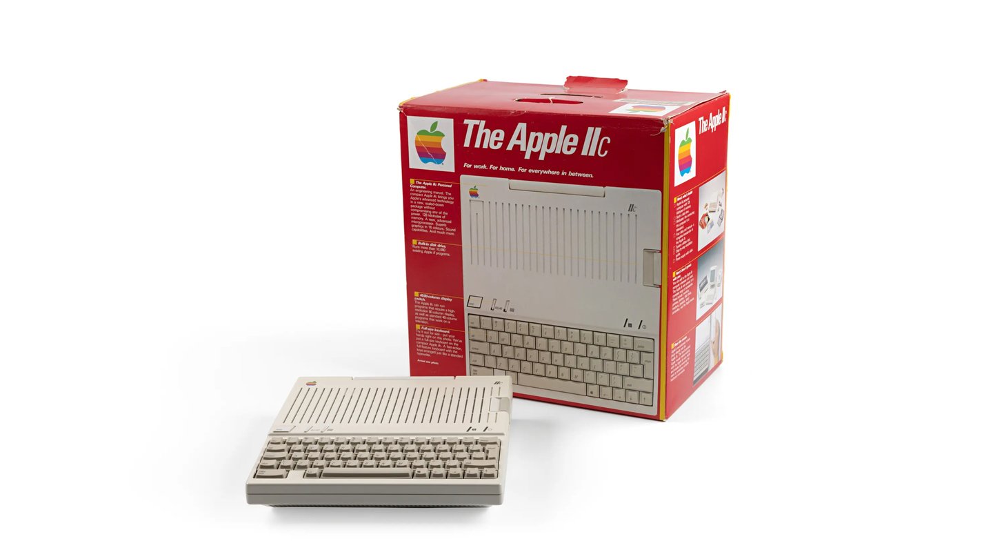
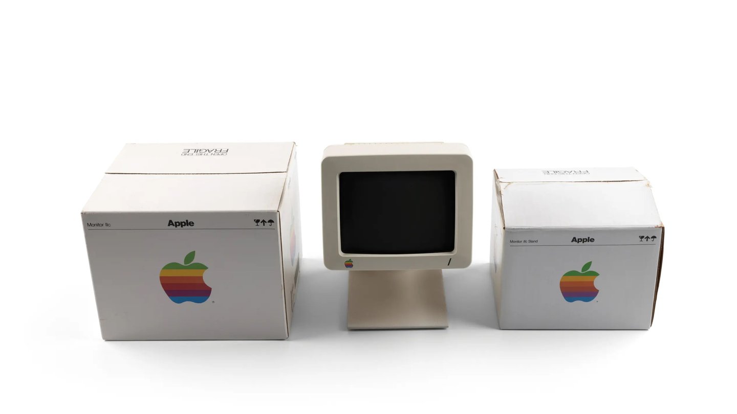
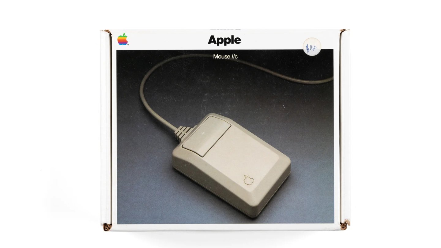
Apple II Monitor, Keyboard, Mouse, 1977–1982
The Rupture: The Arrival of Postmodernism
In the latter half of the 20th century, design gradually moved away from the rigid modernist ideal, which held that form should dispassionately express function. Postmodernism offered a different perspective: an object could be ironic, decorative, emotional, or even intentionally «incorrect.» Aesthetics ceased to be merely an add-on to technical rationality and began to autonomously shape the value of the object.
iMac G3 Advertisement, 1999
For the personal computer, this shift proved decisive. If, during the Apple II and IBM PC era, the computer was a «beige box, ” overtly displaying its technical nature, by the late 1990s, it transformed into a colorful, rounded, translucent object of consumption. The iMac G3 became the most vivid example: it changed not so much how one worked, but the perception of what a computer should look like.
iMac G3, 1999
Postmodernism emerged as a reaction against the universality and rationality of Modernism. Instead of the principle of «less is more, ” it offered a playful engagement with historical quotations, mass culture, kitsch, bright colors, and unexpected materials. Design stopped claiming timelessness; it became a method for provoking, surprising, and forging an emotional connection with the user.
Irony also became a key feature: an object could deliberately subvert expectations. A chair might resemble a sculpture, a lamp might look like a toy, and a cabinet might appear as a multicolored geometric construction. Function did not disappear, but it ceased to be the sole justification for form. Designers began asking not only, „How should the object function?“ but also, „How should it feel, what should it say about the owner, what atmosphere should it create?“ Postmodernism shifted the focus from utility to image: the object became a signifier of style and belonging to a cultural milieu. It is this logic that makes the computer possible as a fashionable accessory.
Carlton Shelf by Ettore Sottsass, 1981
The Italian group Memphis, founded by Ettore Sottsass in Milan in 1980, most clearly expressed postmodernist ideas. Its members worked with furniture, light fixtures, and ceramics, creating objects from bright plastic laminates, asymmetrical forms, and deliberately clashing colors. The Memphites challenged the «form follows function» doctrine; their famous Carlton bookcase combined bright laminates, inclined planes, and decorative elements unrelated to practical use. This design was intended to provoke visual shock, elicit a smile, and ensure memorability.
Karl Lagerfeld’s guest in Monte Carlo, 1983