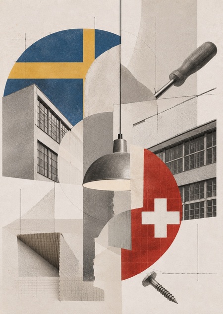
Sweden and Switzerland often fall into the same category of «Nordic minimalism»: both cultures are associated with restrained form, a rejection of ornament, and the belief that a good object should be comfortable and unobtrusive. However, beneath this external similarity lie different types of visual thinking. One strives for engineering neutrality and the object’s «invisibility, ” while the other seeks the „readability“ of the structure and the human gesture.
Introduction
The goal of this work is not to determine whose functionalism is «better, ” but rather to illustrate how two traditions respond differently to the same questions: how to protect a product, how to integrate light into a space, and how to connect components. Four pairs—packaging, hand tools, lighting fixtures, and hardware—were selected to allow the contrast to emerge gradually: from the almost invisible (packaging) to the physically tangible (tools), and further to what is usually overlooked (hardware). The visual sequence is structured around diptychs, allowing the viewer to perceive the difference through the comparison of forms, materials, and methods of interaction with the objects. This methodology reveals what is difficult to articulate verbally: behind similar objects lie divergent concepts regarding how a person should interact with an object.
Navigation Menu
Hypothesis
The similarity between Swedish and Swiss functionalism is one of «rejecting the superfluous,» but it is not on the level of the relationship between object and human.
Concept
To explore how two cultures, both renowned for their restrained functionalism, articulate the relationship between object and human differently, four categories were chosen. These categories do not showcase variation through an «authorial signature» but allow one to trace the very «grammar» of tradition. The four categories—packaging, tool, light, and hardware—were selected not because they are «the most important, ” but because each presents the designer with the same fundamental challenge, albeit with a different degree of visibility in the outcome. Specifically, packaging protects the product, a tool assists the hand, a light fixture integrates light into the space, and hardware connects two components. In each pair, the Swiss and Swedish object solves the identical problem but achieves it through divergent means. The difference emerges not in „beauty, ” but in what each approach prioritizes: structural precision or habitual gesture.
This is a fundamental point. If we consider design «icons"—chairs, lamps, vases—the difference will read as a difference in authorial handwriting. But packaging, tools, hardware—this is «functional» design, where the authorial gesture is minimal, and tradition is visible precisely at the level of grammar: how the form is constructed, how it behaves in the hand, what remains after the interaction. This is why these pairings are not merely «examples, ” but arguments: they demonstrate not „here is a Swiss object, ” but „here is how one culture understands a person’s contact with an object.“
Explanation
Each pair is analyzed on three levels—this is not a formality, but a way to avoid a simplistic observation such as, «here are two objects; they are different.»
The first level is form: geometry, material, color. What is visible when the object sits on a shelf? Swiss objects tend toward geometric precision and silhouette «purity.» Swedish objects gravitate toward softness—to a silhouette that «flows around» the function rather than emphasizing it.
The second level is gesture. How is the object handled, opened, assembled, or used? A Swiss tool dictates movement to the hand; a Swedish one adapts to it. Swiss packaging opens predictably; Swedish packaging fits into the ritual of breakfast. At this level, the difference becomes corporeal.
The third level is residue. What remains after interaction? The mark left by a fastener, the shadow cast by a lamp, the habit formed by packaging. Swiss objects strive for a minimal residue—the object should be imperceptible. Swedish objects aim for the residue to become part of a habit: the object is «mastered, ” not erased.
It is at the intersection of these three levels that the main hypothesis manifests: Swiss functionalism renders the object invisible in service of precise function, while Swedish design makes the function visible and readable as part of human gesture. Each pair tests one facet of this hypothesis, and the chapters are sequenced so that the viewer arrives at this conclusion themselves, rather than being handed it ready-made.
2. Packaging: Construction Against Ritual
Packaging is design that is typically thrown away. It rarely allows for an authorial gesture; instead, it presents a task (to preserve, to protect, to communicate) and its solution. This is precisely why packaging so effectively conveys the «grammar» of traditions and what is usually obscured when discussing design «icons.» It is argued that Swiss functionalism truly strives for the object’s disappearance, leaving behind only its precise function—which should be evident at the level of the box—while Swedish design aims for mastery through habit, which is visible at the level of the wrapping.
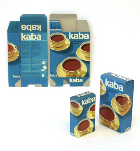
Let’s start with the most «quiet» example. The Kaba hot chocolate box (designed by Erwin Halpern, 1959), which received the Swiss Packaging Award. The jury specifically noted how color photography was utilized: despite its naturalistic quality, the division into planes and the restriction of the motif to a single cup make it appear almost like a decorative element. But the main achievement here is in the construction. The inner pouch, made of lacquered paper, is sealed on all sides, and its top portion is made longer than the contents so the owner can repeatedly fold the edge over to protect the product from moisture after opening. It is worth noting that there is no superfluous movement here: the graphic design, the material, and the form all work toward a single goal—making the product predictable and protected.
For example, on the Swedish side, the Wasa Ragi crispbread packaging was chosen, which is structured quite differently. It is not a rigid box, but a paper band around a cardboard pouch. The red field features sliced bread on a plate and the inscription «Rag i ryggen med Ragi”—a Swedish idiom meaning to „have inner strength, fortitude, and resilience.“ The packaging doesn’t „protect“ the product in an engineering sense, but rather integrates it into the morning meal, which allows for a closer connection between the „packaging“ and the user. Thus, the contrast between the „box“ and the „wrapper“ establishes different relationships with the user even before the item is picked up.
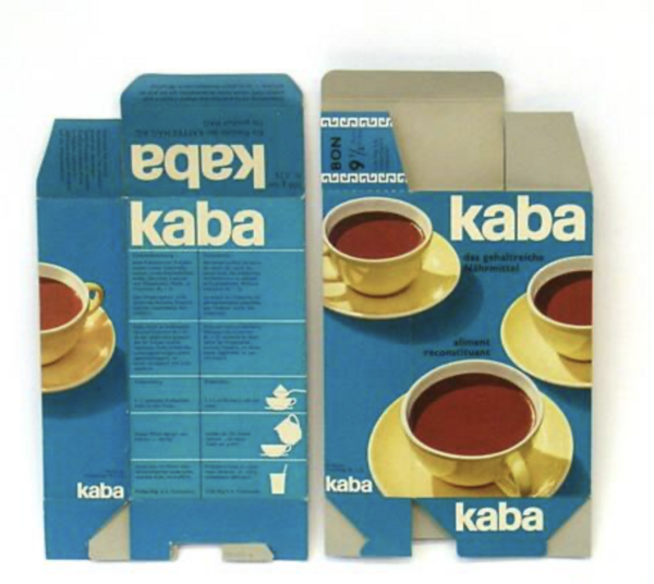
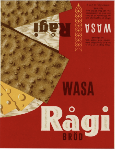
1. Kaba (design by Erwin Halpern, 1959), 2. Wasa Ragi (unknown designer, 1956)
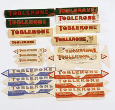
The following example is packaging where the structure does not just serve the product, but becomes an extension of it.The beloved chocolate «Toblerone» (1908) is an example of how Swiss packaging turns structure into a form of thought. The triangular prism of the chocolate is repeated in the series, in the folds, on the box, and in the graphics. The packaging doesn’t «dress» the product; it continues its geometry. Each triangle refers back to the object itself, so the box, the display case, and the advertising are perceived as parts of a single structure. It is believed that the triangular shape of the chocolate was «inspired» by, according to one version, the Alpine peak (the Matterhorn), and by another version, by the «triangular» pyramid of cabaret dancers that greatly impressed Theodor Tobler [5]. This is not decorative geometry, but a principle of organizational thought, where the form of the product and the packaging convey the same message.
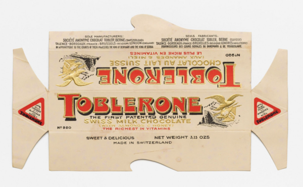
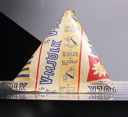
1. «Toblerone» chocolate wrapper, 1909; 2. «Tetra Pak» milk wrapper, 1951
The Swedish solution to the same problem is «Tetra Pak.» The first tetrahedral milk carton was introduced in 1951, and the first commercial machine to produce it was installed at a dairy farm in Lund in 1952. The design arose from simple mechanics: a tube made of moisture-resistant cardboard was welded and cut at right angles, forming a triangular pyramid. It is believed that the Swedes created not only the package’s form but also a unique method for packaging liquid in cardboard. This type of cardboard packaging solved many problems at the time: the package was assembled from a single sheet, the product stored in it lasted as long as in glass, the price was lower, and the empty packet was simply thrown away afterwards.
But while «Toblerone» makes the form visible and recognizable, «Tetra Pak» makes the form functional: it solves issues of hygiene, storage, and logistics. Here, the packaging is not an «image”—it is a tool.
Additionally, there are projects where the difference between two functionalist approaches becomes almost philosophical. This is noticeable in packaging, where the structure or graphic design no longer simply serves the product, but assumes a role typically taken by text.
In Switzerland, an example of this is the packaging for the antidepressant «Pertofran» (Max Schmid for Geigy, 1962), designed so that when the perforated strip was opened, the drawn chain with a core would break.This is not merely a decorative gesture, but a deliberate design where the message aligns with the action of the drug itself. The Swiss approach is reflected here in how the object literally becomes a function.
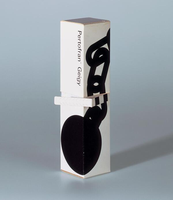
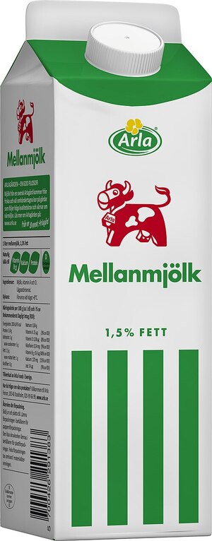
1. Packaging for the antidepressant «Pertofran, ” Max Schmid for Geigy, Switzerland, 1962; 2. Packaging for the milk „Arla, ” Tom Hedqvist, Sweden, 1992
The Swedish milk packaging by «Arla» (Tom Hedqvist, 1992) is structured quite differently—not as a metaphor, but as a direct communicative message. The design of the milk cartons is based on simple bands: thin ones for skim milk, medium ones for semi-skimmed, and wide ones for whole milk. There are no extra symbols to decipher. The bands don’t «symbolize» anything beyond fat content, but precisely because of this, over time, they begin to function as a habit, allowing for much faster selection later on. Over decades, this design has become so recognizable that it is perceived as an intrinsic part of everyday Swedish life.
But this logic hasn’t become obsolete. It’s being reproduced right now—just with new material and new vocabulary.
In 2025, the packaging for Sprüngli’s «Haussortiment Pralinés» chocolate, designed by PAWI Packaging, won the Audience Award at the Swiss Packaging Award. The design features the embossed relief of the historic Sprüngli building in Zurich (in black and gold or white and gold), laser-cut windows for a glimpse inside, and a sliding drawer with a gilded lid. The premium quality is achieved through precise execution and thoughtfully engineered opening mechanics. The packaging excels in its flawless material and construction—echoing the logic of Kaba from 1959, but elevated to a new technological level.
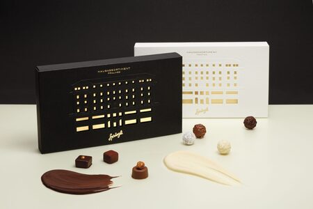
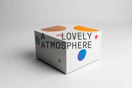
1. Packaging for Sprüngli «Haussortiment Pralinés» chocolate, Switzerland, 2025; 2. GBGT Box packaging «A Lovely Atmosphere, ” design bureau Bedow, Sweden, 2023
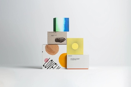
A Swedish response to the same premium packaging challenge is the GBGT Box «A Lovely Atmosphere» (design studio Bedow, 2023). This set consists of five nested boxes, each representing one of Earth’s atmospheric layers. Inside the final, smallest central box is a ginkgo tree seed, which is offered to be planted to support the planet’s ecology. The project received the «Utmärkt Svensk Form 2025» award and a bronze at the European Design Awards.The concept is not about «protecting the product»; it is about telling a story and demonstrating a process. In this instance, the design showcases depth of thought through meticulously developed packaging. I saw this as a metaphor—that «the truth lies in the center, and to know it, one must first travel a difficult path.»Thus, the packaging does not simply disappear—it is perceived as a unique statement that one wishes to keep.
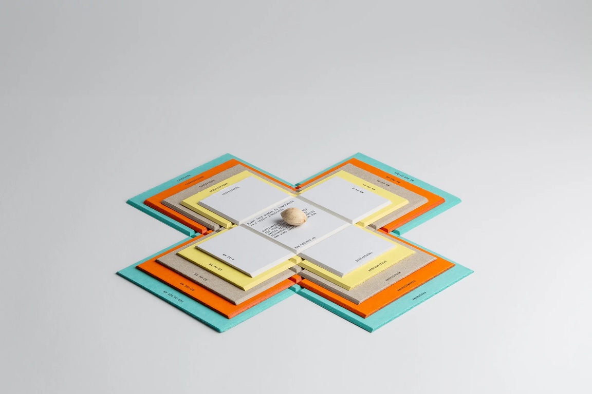
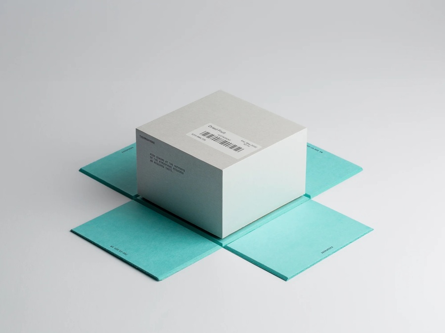
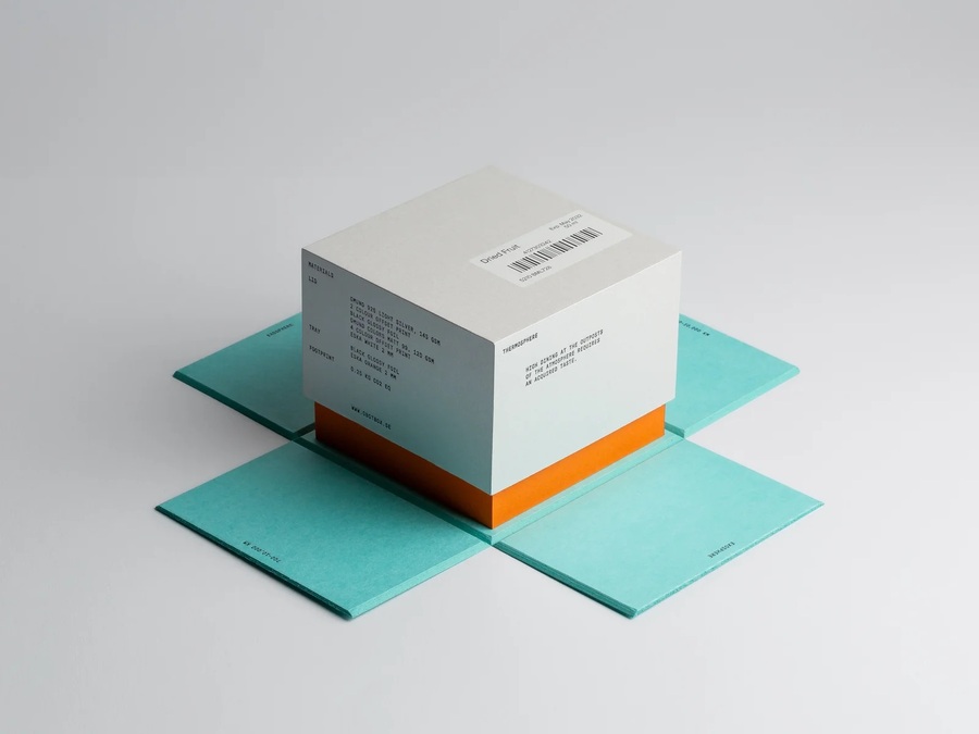
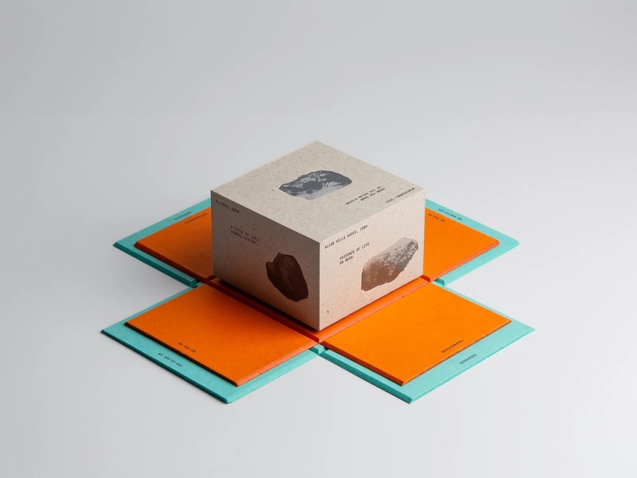
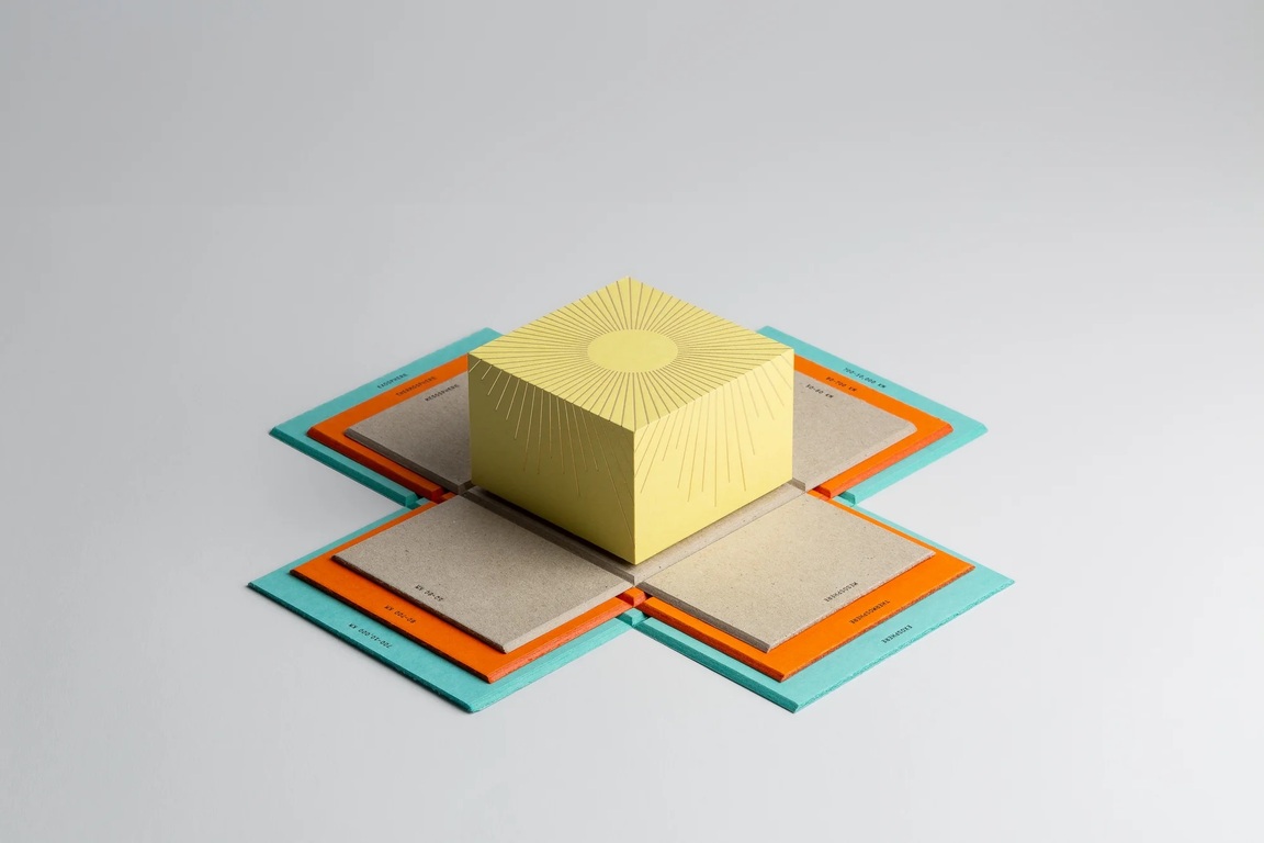
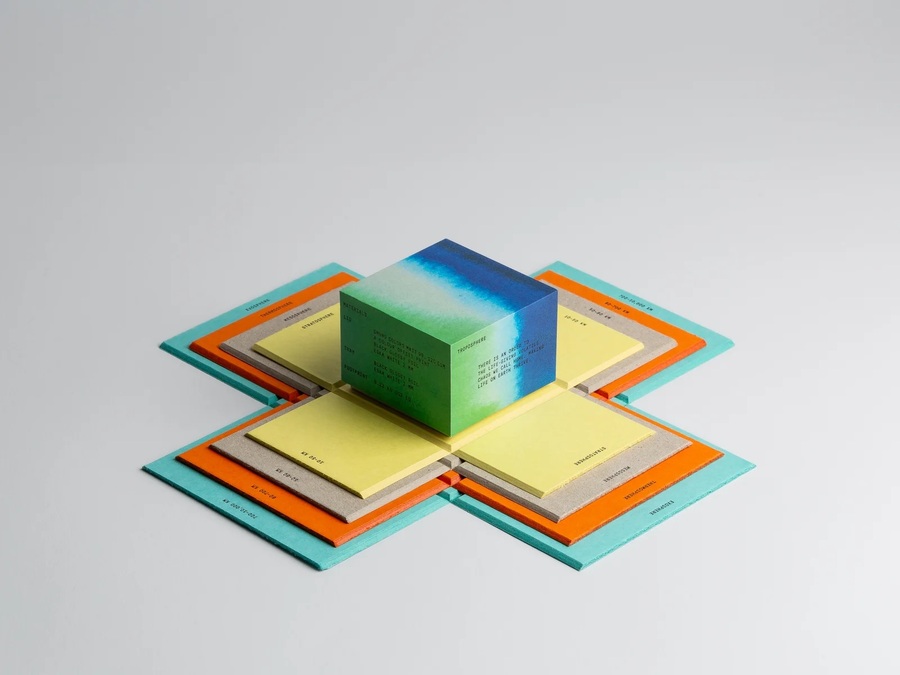
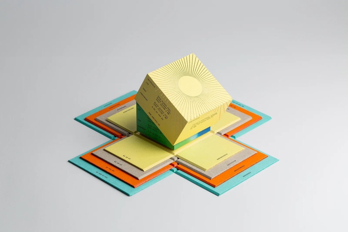
Various layers of the GBGT Box «A Lovely Atmosphere» packaging, Bedow Design Bureau, Sweden, 2023
Finally, one more session—about radical simplification. In 2025, VALSER (Coca-Cola HBC Switzerland) released the first Swiss mineral water without a paper label. The logo and product information are now engraved directly onto the bottle’s surface, and the barcode has been moved to the cap. The bottle shape has been ergonomically refined, and the design is «purist.» This is the logic of «disappearance» in its purest form: everything that can be removed is removed, leaving only function and material.
In 2025, the Swedish company Arla Ko received a Pentawards gold in the Dairy & Soy-based Products category. Tom Hedkvist’s 1992 design is not being «canceled, ” but rather refined to its absolute limit: the stripes denoting milk fat content are brought back to the forefront, and all other elements are minimized so that the „iconic“ mark is read with greater strength. This is not a „disappearance, ” but an amplification of a familiar code—the very one that the Swedish consumer has recognized for decades.