Concept
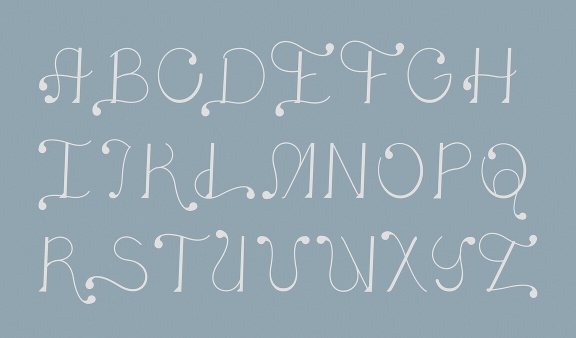
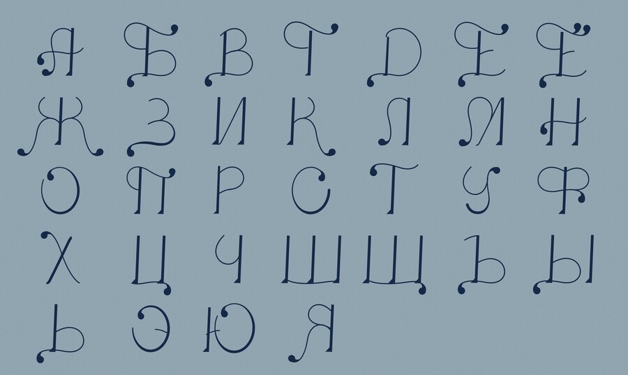
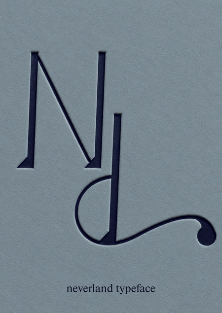
The core concept of the typeface is the idea of freedom, flight, and eternal childhood. The elongated proportions, delicate lines, and unconventional curves evoke a sense of lightness, movement, and a certain unpredictability—as if the letters exist by their own rules, just like the world of Neverland. Neverland is a typeface where the letters refuse to grow up.For references, I selected decorative typography featuring elements of calligraphy and fairytale aesthetics. I was inspired by the elongated letterforms, fine lines, smooth swirls, and unusual stroke endings. During the development process, I reinterpreted these elements through the atmosphere of «Peter Pan.» The main motif is flight and the magical fairy dust that allows the story’s characters to soar. The swirls resemble winding trajectories in the air, while the teardrop-shaped endings represent particles of magical dust.
Ticketing