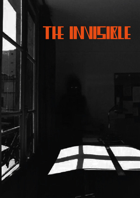
CONCEPT
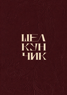
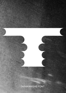
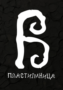
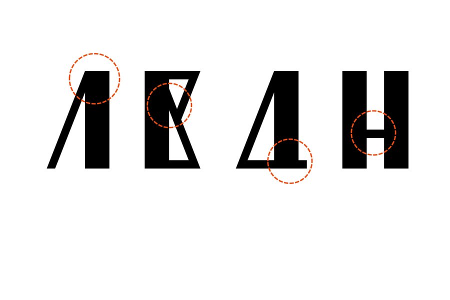
A grim, aggressive, illogical, and chaotic typeface inspired by H.G. Wells' The Invisible Man, featuring a contrast between thick and thin strokes and distorted details. The font breaks conventional rules—letters and symbols merge, shift, create voids, flip, transform into their reflections, extend beyond boundaries, and vanish into ligature connections.
Features
Contrast between thick and thin lines
Flipping and inverting letters—characters easily transform into their reflection
Ligatures
Negative space within and between letters, contrasting with ligatures and elements extending beyond the baseline
Original size 2696x1796

1/3