Concept
German poster styles in the late 19th and early 20th centuries fundamentally shifted the thematic vector of works from this period.
In the late 19th century, authors employed Jugendstil—a style rooted in natural elements, fluidity, and the delicacy of lines in imagery. In the early 20th century, the poster style (or poster art style) began to emerge in Germany—a distinct direction within graphic design. Lucian (Lucien) Bernhard is considered its founder. He created this style and subsequently devoted himself to its development. Bernhard’s approach to work was highly practical: for every poster, he selected the appropriate visual language to precisely and thoroughly convey his concept. The foundation of this style lies in the simplification of advertising posters. Subsequently, a narrower movement, Sachplakat, developed, which is a style associated with objects in design.
In my longread, I examine these styles in greater detail—their typographic and graphic elements, their distinguishing features, and the ideas embedded in covers, magazines, and posters.
This topic interests me because the spectrum of ideas being disseminated to the masses shifted so dramatically in such a short timeframe. Each style of work possesses unique characteristics that preserve the trends and historical events of that era. Precisely in Germany occurred a breakthrough in design art that defined poster style for many years to come.
The poster was meant to carry a message to the masses; it was perceived as «street art.» Its appearance in public squares often caused a sensation…
Posters become something more than just images. They have evolved beyond being mere advertising for a service or product; they now serve as reflections of an era—a wartime period, people’s experiences, and their suffering. They have become something that evokes emotion and stirs the feelings of a people for whom these works reflect their own emotions. Posters conveyed the author’s feeling of unity and understanding—that no one in this world, despite their individual experiences, is alone.
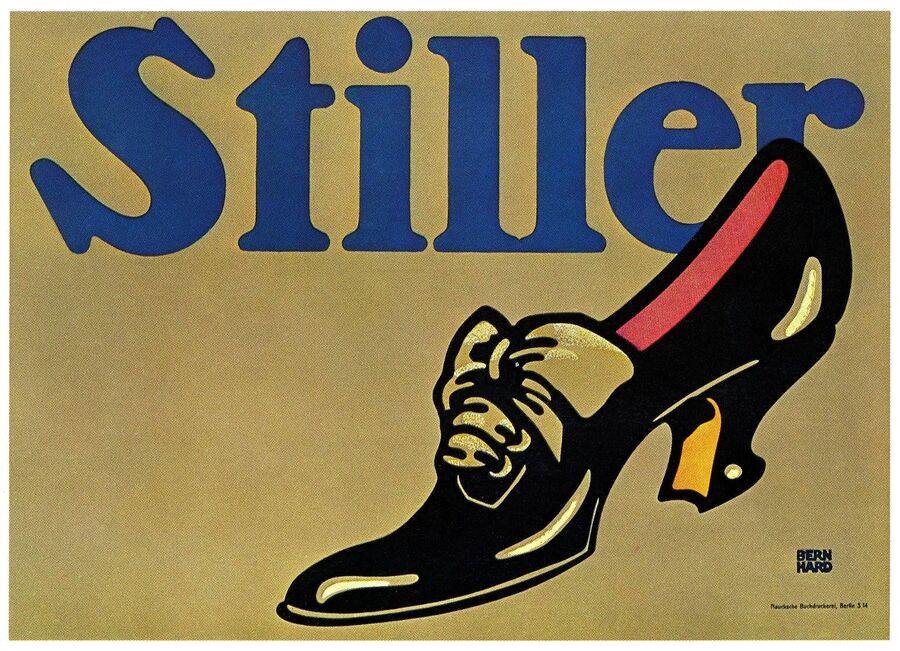
Advertisement for the renowned German shoe brand «Stiller,» Lucian Bernhard, 1908.
During my work, I asked myself the central question:
«Why did the German poster of the turn of the century shift from tenderness and detail to a certain object-based conciseness and simplicity of imagery, and subsequently to the use of images depicting military tragedy?»
Based on the posed question, I formulated the following hypothesis: the themes addressed in the posters served to create and develop new poster styles, allowing for a fundamental shift in the visual vector—moving from softness and tenderness to military brutality through the elements in the works. Furthermore, they reflected and demonstrated the historical events, feelings, and emotions experienced by both the author and the public during that period.
Work Plan:
- Chapter 1. Jugendstil as the starting point (1890–1900);
- Chapter 2. Crystallization of the «poster style» (1900–1907);
- Chapter 3. Sachplakat/Plakatstil as the dominant style (1907–1914);
- Chapter 4.1. War posters (1914–1918);
- Chapter 4.2. Transition to new typography in war posters (1918–1920);
- Conclusion.
For this piece, I opted for a chronological structure to examine how the style, imagery, and ideas in posters evolved across different time periods, and what techniques the creators employed in their work. In conducting this visual research, I utilized various sources of information, including peer-reviewed academic articles, Russian-language and English-language websites, and my personal analysis when describing the posters. Furthermore, I conducted an extensive study of the historical context of military posters, as this context is fundamental to understanding these works.
Chapter 1. Jugendstil as a Starting Point (1890–1900)
Jugendstil (from German Jugendstil — «young style») is the German and Austrian designation for the Art Nouveau movement, prevalent from the late 19th to the early 20th century. [3] In posters, this style manifested as a decorative art characterized by ornamental forms and expressive techniques. [3]The term originated from the Munich arts and literary journal «Jugend» (founded in 1896 by Georg Hirth), which actively championed new artistic directions.Jugendstil served as a predecessor to poster design while existing in contrast to it.
Cover of «Jugend» magazine, Otto Eckmann, 1896.
Jugend-style posters are characterized by smooth, delicate yet clearly defined lines and large blocks of color. A central composition was most frequently used in the work. Furthermore, Jugend style is distinguished by a predominance of botanical elements, a certain «fluidity,» and «flow» in geometric shapes. Jugend posters and magazine covers aimed to create a «new way of life.» They were used in advertising for products and events such as exhibitions or theatrical productions.
One cover of the magazine «Jugend,» which played a colossal role in art history, depicts a young woman. She is eating a cherry, and her gaze is directed toward the viewer. The soft, fluid pastel lines used in the main character’s portrayal convey lightness, carefree spirit, and tenderness—qualities highly characteristic of the style presented. Additionally, the typography in this piece complements the branches in the background and possesses a certain organic style.
Excerpt from the cover of «Jugend» magazine, Issue 40, Joseph Rudolf Wittels, 1896.
Posters and covers, beyond serving as advertisements for various products of the time, could also touch upon many other themes, such as motherhood—as seen in the cover of Jugend magazine, Issue 40, by Josef Rudolf Witzel. The featured poster, depicting a mother and daughter, is filled with tenderness and warmth. Furthermore, posters in this style very frequently addressed themes of youth and beauty.
Fragments from the cover of Jugend magazine, Issue 40, Joseph Rudolf Wittchel, 1896.
The typography used in the title of the «Jugend» magazine cover is equally unusual. Images of a mother and daughter are incorporated into every letter, and they appear together in the letter «G.» In this way, the technique demonstrates moments from their lives.
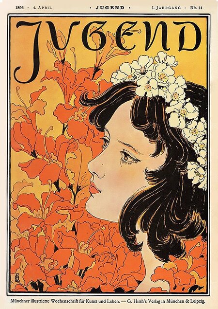
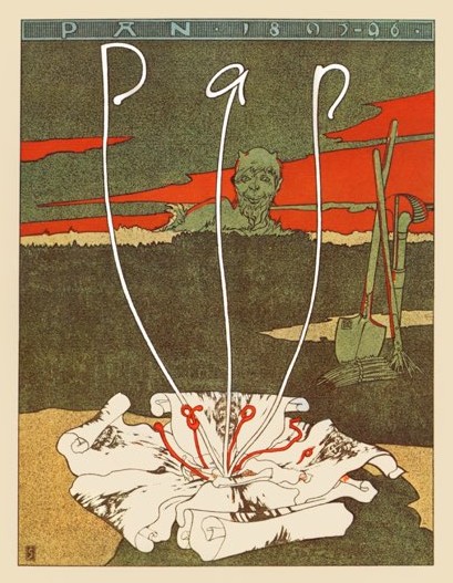
«Jugend» magazine cover, Otto Eckmann, 1896 / «Pan» magazine cover, Josef Ziegler, 1895
Both works belong to the Jugendstil style, yet they differ in mood. The image on the left features a delicate and beautiful girl wearing a wreath of flowers. The background continues the botanical theme with a backdrop of lilies. All the colors in this work are vibrant and rich, a quality not found in the cover on the right.
Josef Ziegler’s work features various shades of green. In the background of the cover, we see an unusual and grotesque creature—the ancient god Pan, patron of forests and shepherds—standing behind bushes against a crimson glow. He is looking at a white flower—a symbol of the printing press’s power. Its petals resemble sheets of white paper, on which black typographic ink has been applied. The stamens of the flower flow into each other, forming the cover’s title and date of issue. A little further from Pan, we see a shovel and a hoe stuck in the ground, which serves as an allusion to «cultivating the soil» to create new art and literature.
Building upon the Jugend style, a poster aesthetic developed that shed the over-detail and complexity of Jugend, becoming more minimalist and refined.
Chapter 2. The Crystallization of the «Poster Style» (1900–1907)
By the early 1900s, a growing drive toward simplification, poster-like clarity, and visual comprehension became apparent, as the primary function of the poster shifted to the ability to be viewed from a distance. Posters, flyers, and magazine covers increasingly took on a commercial character, becoming advertisements for a wide range of products.A critical stage in the formation of poster style involved the German graphic artist Lucian Bernhard. It is believed that the earliest posters associated with this style date from 1905–1906. They were created for the Priester company.
«Priester» or «Priester Matches, ” Lucien Bernhard, 1905.
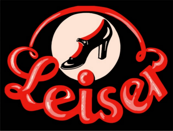
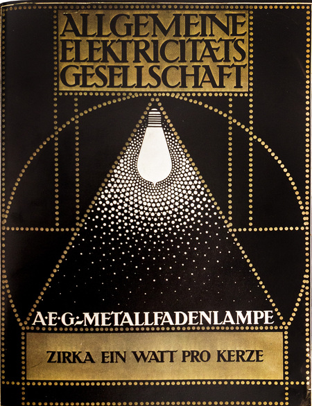
Poster for the shoe company «Leiser,» Julius Hippkens, 1907 / «A.E.G.-Metal Filament Lamp» (from German «Metal Filament Lamp AEG»), Peter Behrens, 1907.
In all three posters, the advertised product becomes the central focus. All works utilize a minimal color palette, and the product image is flat and primitive, yet it maintains the viewer’s attention through unconventional solutions.The poster for Priester matches used textured paper that resembles the color and texture of the box against which a match is struck.Julius Hippkens’ work, which advertises a shoe company, incorporates an interesting and vibrant typeface that features highlights, much like the shoes themselves, symbolizing the lacquered finish and the resulting sense of sophistication.The third poster uses a shimmering gold paint, and the entire piece is composed of dots connected by lines, symbolizing the metal filaments used in the advertised product—the incandescent bulb.
In most works by various artists, echoes of Art Nouveau can still be seen, yet a consistent idea runs through them—concise minimalism: a small color palette, large forms, and clear imagery, which allows the viewer to easily decode the concepts and advertising ideas that the artists are presenting.
Chapter 3. Sachplakat/Poster Style as Dominant (1907–1914)
During this period, the poster style became more firmly established in Germany, dividing into two main directions: Plakatstil and Sachplakat.
Plakatstil (from German «poster style») is a broad term for the style of posters in Germany in the early 20th century. Key characteristics include large typography, flat and vivid colors, simplified forms, and clear composition.
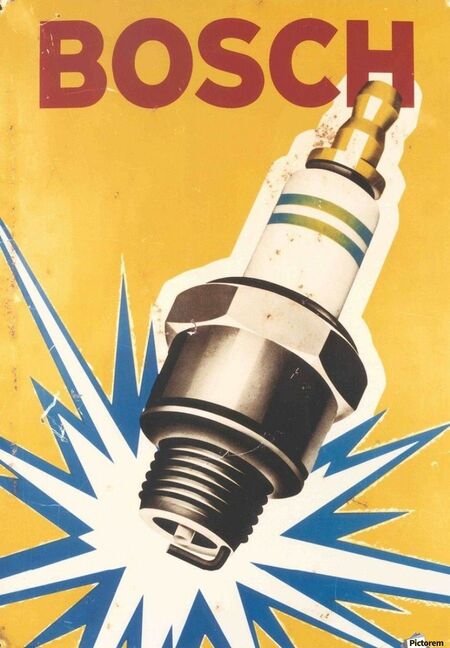
Sachplakat (from German «object poster») is a smaller offshoot of Plakatstil, characterized by the advertisement of a specific product at the center of the composition, although the posters remain equally vibrant and concise.