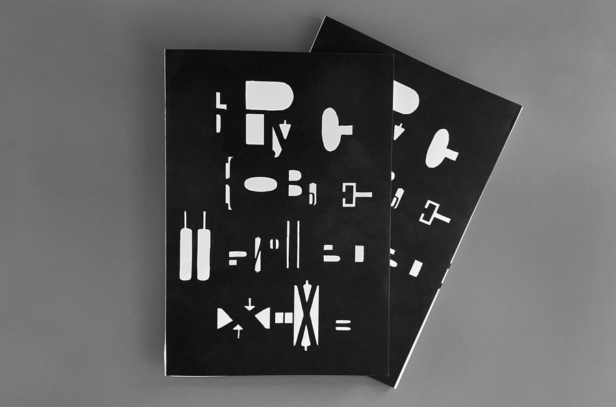
Longread translated automatically
Original size 2480x3500
BEST DESIGN
December
2024
This project is a student project at the School of Design or a research project at the School of Design. This project is not commercial and serves educational purposes
The prizewinner of the competition
DAFES choice. December 2024 
Original size 5167x3417

The visual study focuses on 19th-century paper typefaces. It was at that time that they became particularly popular with the promotion of advertising.

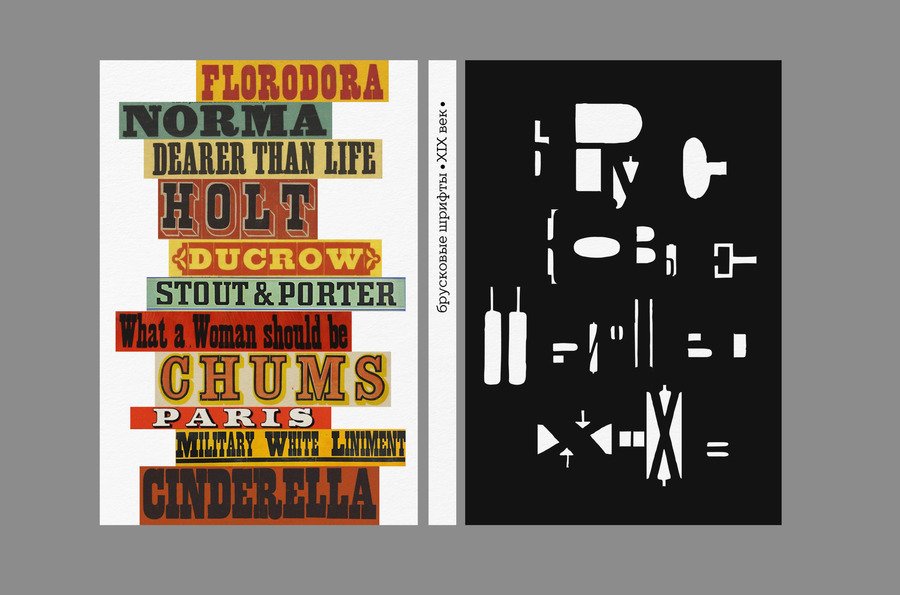
The fonts were selected from various 19th-centurypesmen, and promotional posters were found using paper typefaces and modern fonts that refer to historical scripts.
Original size 5167x3417

Cover design
Original size 5167x3417

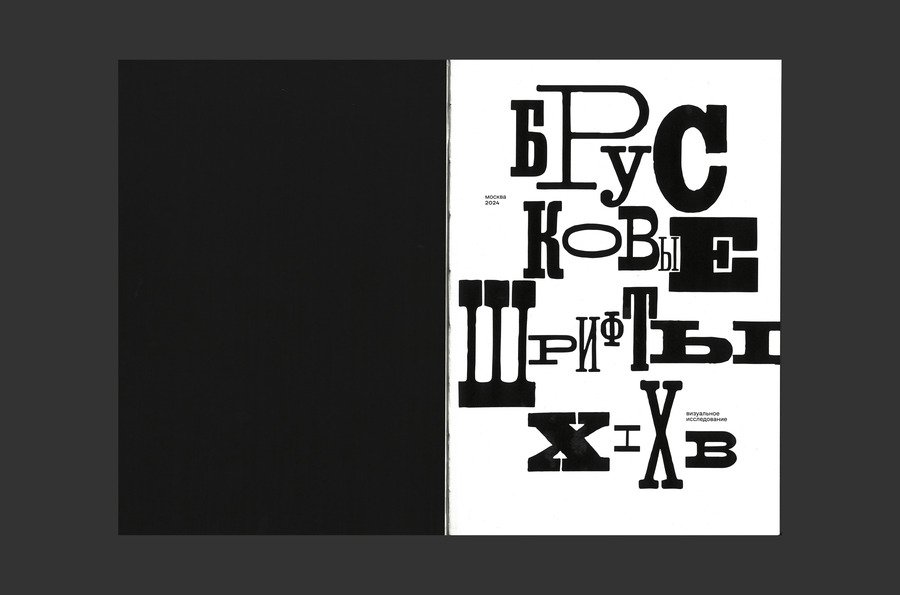
All fonts are divided into three categories corresponding to the proportions (narrow/normal/broad).

Original size 5167x3417

used fonts TT Slabs (for concept text, 20pt), CoFo Sans (for column elements, 8pt)

Original size 5167x3417

format 260×180

Original size 5167x3417

Schmutztitul

Original size 5167x2500
Original size 5167x3417

at the end of each section there is a comparative turn

Original size 5167x2500
Original size 5167x3417
Original size 5167x2500

Reversals comparing modern and historical string typefaces

Original size 5167x3417
Original size 3242x2144
Brooke typefaces. The 19th century.
Полина Артемьева подготовила визуальное исследование, посвящённое брусковым шрифтам XIX века, которое анализирует их популярность в эпоху рекламы. Проект включает разделение шрифтов на три категории по пропорциям: узкие, нормальные и широкие.
Project description created with AI
Project created at 12.12.2024
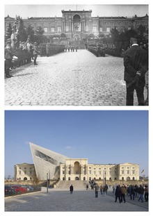
Вероника Поздеева рассказывает о преобразовании музеев в современные культурные центры с открытым доступом и новыми функциями. Проект анализирует, как расширения традиционных музеев влияют на городскую среду и культурную идентичность.
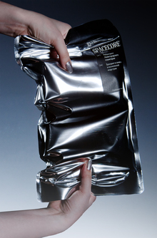
Екатерина Подборная изучила влияние дизайна логотипов на формирование бренда в космической индустрии. Исследование показало, что упрощение символов улучшает читабельность и масштабируемость знаков, делая их более близкими к людям.
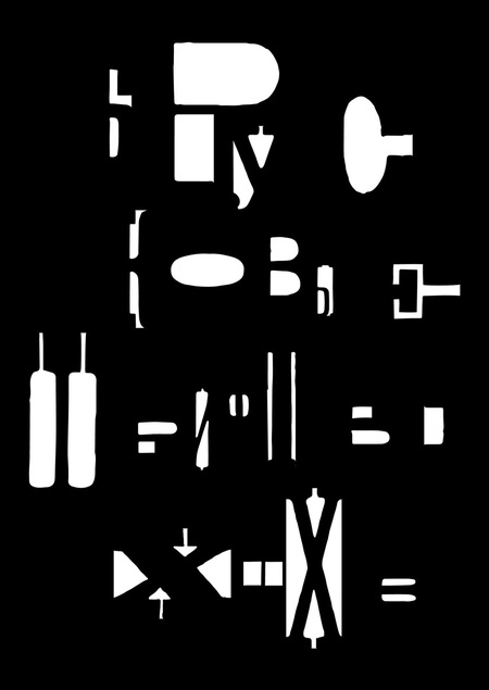
Елизавета Скурихина исследует современный танец как языковую систему в работе «Семиотика танца». Проект анализирует хореографию с точки зрения её грамматики и коммуникативных возможностей.
hseanimation
HSE Animation is a platform where animation projects become visible to studios, production companies, media, partners, and audiences. It brings together animators’ portfolios, educational programs, specialized contests, and key events from the professional community. The platform was created in partnership with HSE Art and Design School and is developing a... Show more
best of the best
news and interviews
author's animation
for children
applied animation
information video
playlist