1. INTRODUCTION: — The history of the brand — Positioning and values 2. COMMUNICATION CHANNELS 3. THEORETICAL FRAMEWORK 4. ANALYSIS: — Visual identity — In-store engagement — Social media 5. CONCLUSION AND RECOMMENDATIONS 6. LIST OF LITERATURE AND USED SOURCES
1. INTRODUCTION
The history of the brand
Tseh 85 is a bakery chain based in St. Petersburg that was founded in 2016. The brand was born from the idea of creating a cozy neighborhood bakery that people would want to visit every day. The first location opened at Lensoveta Street, 70; by the end of 2016, there were 9 locations, and by the end of 2017, 25. Today, Tseh 85 is a chain of over 170 bakeries in St. Petersburg, Moscow, Omsk, as well as the Moscow and Leningrad regions.
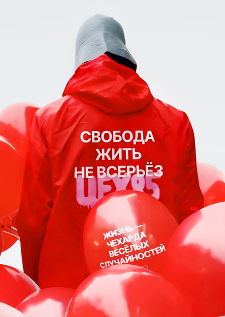
Promotion poster with a slogan.
Positioning and values
From the very beginning, Tseh 85 has stood out from its competitors by completely rejecting off-the-shelf products and purchased components in favor of its own production, meticulously planned down to the smallest detail. The focus has been on manual labor and the use of modern technologies, as well as maintaining the quality of taste. The brand is known for its bold communication, sincerity, and freedom from prejudice, as expressed in their slogan «The freedom to not take life too seriously». On one hand, the brand’s archetype is the fierce Outlaw, while on the other, it’s the Everyman — someone who resonates with a broad audience.
2. COMMUNICATION CHANNELS
Tseh 85 actively uses VK, Telegram, Instagram* and other digital platforms to communicate with its audience. The brand maintains a strong presence on social media, where it regularly publishes both promotional and entertainment content. Memes, viral trends, and short-form videos are widely used, making the brand’s communication feel relatable, engaging, and relevant to younger consumers. The company’s PR strategy focuses on audience engagement through promotional campaigns, discount codes, and limited-time offers. Tseh 85 also launches themed products tied to holidays, cultural events, movie releases, and popular online trends. These limited editions help attract attention from both Gen Z and Millennial audiences while reinforcing the brand’s image as current and culturally aware. A key characteristic of the brand’s public communication is its light-hearted and humorous tone. Rather than relying on formal corporate messaging, Tseh 85 adopts a friendly, playful voice that strengthens emotional connections with customers and helps build a loyal online community around the brand.
*Instagram is owned by Meta, an organization recognized as extremist and banned in Russia.
3. THEORETICAL FRAMEWORK
Our analytical lens is based on two theories. The first one is the Impression Management Theory by Goffman. It examines hidden signs and metaphors that are not conveyed directly through what is said, but rather through the audience’s interpretation of specific cues that shape their perception of the brand. We will look at how Tseh 85 creates its social identity and will focus on how the brand «gives off» symbolic parts of it. What specific keys and clues from the target audience do they pay attention to in order to become closer to them? Who they are trying to build empathy and alikeness with? And most importantly, how are they doing it?
Brand’s merchandise.
The second theory, the Uses and Gratifications Theory, will help us analyse brand from the prism of their TA’s needs and goals in consuming content. What helps the target audience to find it in a sea of alternatives? Why are they choosing Tseh 85? What needs do they satisfy in communication with the brand? We will also use the Narrative Paradigm to analyse not only the hidden messages that the brand sends to the audience with it’s identity, but also which values are embedded in that message, how it’s overlap with the audience worldview, and how it helps Tseh 85 build an effective communication with people.
4. ANALYSIS:
Let’s have a look on particular elements of the brand’s communication. The analysis is organised according to the main communication touchpoints through which consumers encounter the brand. This approach allows us to examine how Tseh 85 constructs its identity across different levels of interaction with the audience.
— Visual identity
The first section focuses on brand identity and visual communication. It analyses the visual elements of the brand and symbolic cues that shape consumers' first impressions.
Promotional materials.
Back in 2024, Tseh 85 underwent a rebrand. What’s interesting is the way it was presented: they created banners and posters bearing the slogan «не ребрендинг, а шляпа какая то» («not a rebrand, but some kind of joke»). This was a playful nod to the audience’s likely scepticism regarding the shift from the old, familiar design to something new. First, the audience sees a provocation in the form of a joke about a possible reaction, and only then is it introduced to the rebranding itself. Mostly it was not the announcement of the design change that really mattered, but the shift in the emotion and brand positioning. So, the rebranding campaign was structured as a story rather than a traditional announcement. Through conflict, suspense and eventual revelation, Tseh 85 engaged consumers in a narrative process that encouraged active interpretation and participation.
The slogan «Freedom to not take life too seriously» communicates a broader worldview that resonates with consumers seeking lightness and self-expression. Simultaneously, it contributes to the brand’s identity as playful, unconventional and emotionally accessible.
Promotional materials.
The central visual metaphor underlying the new style is the concept of mass production. Illustrations and photographs of menu items are arranged in a pattern that resembles an assembly line in a factory. This helps create strong associations with the bakery’s name and draws the customer’s attention to the quality standards maintained. The predominantly red color palette is accented by a bright pink hue and several muted background shades. This new rebellious direction is emphasized by provocative photographs in the brand’s visual communications, as well as the use of graffiti-style effects in the illustrations. The conveyor belt concept is also reflected in the typography: the brand’s copy is arranged in a conveyor belt pattern, which is used on cups, boxes, and wrapping paper.
Promotional materials.
Brand’s food packaging.
— In-store engagement
The second section examines offline communication and customer-facing initiatives that can be experienced without following the brand on social media. This includes promotional campaigns, seasonal products, in-store messages, collaborations, special events and other communication practices that visitors encounter directly in physical locations.
Launching desserts and drinks linked to current events, films or online trends (for example, eclairs associated with characters from a popular series «Euphoria», that was in a process of releasing at a time) helps the brand tap into the news cycle and attract additional attention from its audience. Such products create a sense of novelty and limited availability, which stimulates interest and encourages impulse purchases. Furthermore, themed new products are more likely to be discussed and shared on social media, increasing the brand’s organic reach. This allows Tseh 85 to maintain its image as a modern bakery that responds quickly to cultural events and the interests of its audience.
Promotional materials released to coincide with the launch of exclusive desserts inspired by characters from the TV series «Euphoria».
Promotional materials for the launch of a peach-flavored bun, advertised by a lookalike of the famous actor Timothée Chalamet.
They also produce novelty products, reinforcing the brand’s playful positioning. Take, for example, the bucket of iced coffee: whilst its shape is rather impractical, it makes customers chuckle that such an option is available to order. Laughter is a rather powerful emotion that encourages visitors to engage emotionally and associate the coffee shop with positive feelings. Thus, this menu item helps create a favourable impression of the brand.
Promotional materials for the iced coffee bucket promotion.
The app adopts an easygoing tone. Users are addressed informally, there are slogans suggesting that Tseh 85 is a ‘buddy’, and there are some amusing characters. That said, the light-hearted tone isn’t overdone; the app maintains a sense of distance and user-friendliness, with a clean design, which keeps it sufficiently neutral for a broad audience.
Screenshots of the Tseh 85 mobile app.
Tseh 85 has a fun way of playing on its own mistakes. When the brand planned to launch in the Moscow market, they created printed job advertisements which were displayed in every branch. But there was a typo in them — a single letter was missing, which looked rather amusing. The Tseh 85 team turned this situation into a competition involving the audience: whoever took a photo of the error-free version (error-free leaflets were printed later) would receive bonuses in the app. Instead of concealing the mistake, Tseh 85 transformed it into a playful contest. The brand’s mistake provided an opportunity to engage the audience in a scavenger hunt with prizes. Such communication reinforces the image of a self-ironic brand that is not afraid of imperfection and is capable of laughing at itself. It can therefore be said that the crisis management was effective.
Printed materials containing a typo.
— Social media
The third section explores social media communication and direct interaction with audiences. Particular attention is paid to the brand’s tone of voice, use of memes and trends, engagement with user-generated content, responses to comments and the ways in which Tsech 85 builds relationships with consumers through digital platforms.
Through the use of young employees and participation in current social media trends, Tseh 85 constructs an image of a youthful and culturally aware brand. According to Goffman’s Impression Management Theory, organisations strategically manage audience impressions by presenting specific identity cues. In this case, the brand signals similarity with Generation Z and positions itself as a member of the same social group rather than a traditional bakery. Narrative Paradigm suggests that people interpret reality through stories. By creating products inspired by Harry Potter, Friends and Gossip Girl, Tseh 85 connects its communication with narratives that already carry emotional meaning for consumers. This strengthens identification with the brand and increases emotional engagement. These references also contribute to the brand’s image as culturally aware and emotionally relatable. This can also satisfy the audience’s need to belong to something (in this case, the fandom of the films or TV shows mentioned), in line with Uses and Gratifications Theory.
Examples of how brand engages with Millennial audience.
Examples of how brand engages with Generation Z audience.
Memes satisfy entertainment and social interaction needs, which are central motivations described by Uses and Gratifications Theory.
Examples of how memes and popular trends are used in communication.
By reposting user-generated content, expressing affection through visual symbols such as heart emojis and responding politely even to criticism, Tseh 85 performs the role of a supportive and friendly community member. These actions contribute to the construction of a warm and approachable social identity.
Examples of brand engagement with the audience.
5. CONCLUSION AND RECOMMENDATIONS
The brand thus has a clearly defined positioning that creates a distinctive social identity (Impression Management Theory) of a friend who is close to the audience, unafraid to poke fun at themselves, and who is both relatable and appealing thanks to the high quality of their work. The company also uses a narrative paradigm, engaging its audience through provocative and humorous headlines and organising competitions, which helps to create an emotional connection. It can also be said that Tseh 85 fulfills the audience’s need to feel a sense of belonging (by referencing cultural phenomena and addressing them as friends within their community), as well as their need for relaxation and entertainment (through a lighthearted tone and memes). In visual communication, these traits are evident in the blend of a bold, playful style and simplicity; in in-store engagement, they manifest as fun menu items that reference trends and popular cultural events; and on social media, they take the form of trending youth memes that demonstrate a connection with the audience. In our opinion, the brand’s communication strategy is effective and logical, as it promotes the coffee shop to the younger generation without alienating older patrons, while remaining accessible and entertaining for everyone. Our only advice would be to continue with this communication approach, as it reaches a wide audience and makes Tseh 85 an increasingly relevant and memorable brand.
Brand’s official web-site; https://tseh85.ru/(Date accessed: 14.06.2026)
«The Tseh 85 chain of café-bakeries»; Suprematica https://suprematika.ru/portfolio/tceh85/ (Date accessed: 14.06.2026)
«Tseh 85 history»; Zhenya Vostokina; Garage magazine https://garagemag.ru/ic85olps (Date accessed: 14.06.2026)
https://www.instagram.com/tseh85/ (*Instagram is owned by Meta, an organization recognized as extremist and banned in Russia) (Date accessed: 14.06.2026)
https://t.me/tseh85bakery (Date accessed: 14.06.2026)
https://suprematika.ru/portfolio/tceh85/ (Date accessed: 14.06.2026)
https://vk.com/tseh85 (Date accessed: 14.06.2026)
https://skillbox.ru/media/design/pekarnya-tsekh-85-vypustila-dva-milliona-pechatnykh-materiala-s-opechatkoy/ (Date accessed: 14.06.2026)
https://www.sostav.ru/publication/set-pekaren-tsekh85-provela-masshtabnyj-rebrending-70765.html (Date accessed: 14.06.2026)


