Bio-Digital balance: REM as a regulatory communication system
Media Ecology Theory posits that the environments we inhabit act as «extensions» of our body, fundamentally shaping our perceptions and social behaviors. We view the REM product as a critical liquid interface designed to manage the physiological demands of the digital era. In the context of remote work-defined by sedentary hours, stress, and constant connectivity-the human nervous system is under unique strain. Our beverage is thus positioned as a compensatory medium that regulates the user’s state (toning or calming). The design must visually communicate this utility, presenting the product as an essential tool for biological adaptation, rather than a conventional refreshment.
The Elaboration Likelihood Model (ELM) guides how we structure our message to achieve maximum persuasion. We recognize that the target audience-busy, often stressed remote workers-engages with product information through two distinct cognitive pathways:
1. The Peripheral Route: The clean, minimalist, and often clinical aesthetic of REM packaging acts as a powerful peripheral cue. It immediately signals medical authority, scientific rigor, and safety, allowing the consumer to build rapid, intuitive trust when they lack the time or motivation for deep scrutiny.
2. The Central Route: For the rational and health-conscious consumer, we ensure all scientific data, ingredient details, and dosage rationale are presented in a clear, accessible hierarchy. This supports the central route of processing, satisfying the user’s need for fact-based evidence.
Uses and Gratifications Theory dictates the functional core of our brand identity. We acknowledge that our audience is active, selectively seeking products to satisfy specific psychological or physiological needs («gratifications»), such as tension release or enhanced focus. Consequently, our design functions as a System of Functional Navigation. The product lines are explicitly labeled by the specific physiological outcome they deliver («Focus», «Calm», «Energy»), directly aligning the visual communication with the user’s goal of state management and minimizing decision fatigue.
Social Identity Theory informs our community-building strategy. We position the consumption of REM as an element of a shared, positive identity. By choosing REM, the user shifts their self-perception from a passive recipient of burnout to an empowered member of the «bio-conscious professional» in-group. The product’s aesthetic becomes a badge of honor, symbolizing a commitment to sustainability and proactive self-care amidst the relentless pressure of remote work.
In conclusion, REM’s design communication transcends mere aesthetics; it is a theory-driven System of Control. We leverage established communication concepts to construct a visual language that reliably promises efficiency, control, and functional balance to our targeted audience.
REM: Reclaim your day. Your nervous system, decoded.
The remote paradox
We know the routine: The home office promised freedom, but delivered crushing back-to-back calls, endless deadlines, and the unique stress of a life lived online. Your mind is always on, but your body is often stationary, stuck between high-intensity sprints and the sudden crash of burnout. You need a way to switch off the noise and switch on your best self-without complicated routines or unhealthy compromises.
Introducing REM: The bio-conscious workflow
We created REM as the essential tool for the modern professional. This is not just tea, juice, or lemonade. REM is the first line of functional beverages developed in partnership with medical experts specifically for the remote lifestyle. We took the complexity of biochemistry and bottled it into a simple, delicious system designed to balance your nervous system.
Health made simple: Just two modes
FOCUS MODE: Your deadline fuel. Packed with physician-approved nootropics and vitamins, this blend is engineered to enhance concentration, improve cognitive endurance, and sustain your energy through that 3 PM slump-all without the jitters.
RELAX MODE: Your off-switch. This calming complex soothes your stressed nervous system, reduces the mental noise from a day of screens, and signals your body that it’s time to truly log off. Perfect for unwinding the day and preparing for restorative sleep.
Our promise to you
We handle the science — you handle the success. Every can and bottle of REM is a commitment to quality ingredients and responsible formulation. Stop surviving the remote world. Start mastering your state, one healthy drink at a time.
REM: The Next Frontier in Performance-Driven Neuro-Nutraceuticals
The market imperative: Managing the remote work physiology crisis
The global shift to remote work has created a chronic, sustained wellness deficit among high-value knowledge workers. Our target demographic (25-45, high disposable income, digitally native) suffers from unique, compounded stress, cognitive fatigue, and the consequences of a sedentary lifestyle. This is no longer a general hydration market; it is a bio-regulatory market demanding precision. REM addresses this critical gap by moving beyond general wellness to offer precision-engineered functional support tailored to the remote workflow.
Scientific validation and formulation integrity
REM is a pioneering line of physician-developed beverages. Our commitment is to efficacy, not novelty. Our formulas are based on established clinical research regarding neuro-adaptive compounds and stress management.
Mode of Action: We utilize synergistic combinations of proven adaptogens, high-potency B-vitamins, and nootropics at concentrations designed to elicit a predictable, measurable physiological response.
Product Segmentation: The clear «Focus» and «Relax» modalities are supported by distinct, verifiable chemical profiles, allowing for targeted consumption and predictable inventory management.
Delivery System: Our diverse formats (Cold Brew Tea, Low-Sugar Juice, Sparkling Limonade) ensure optimal bioavailability and widespread appeal across various consumption moments and user preferences.
Strategic communication: Leveraging cognitive models for retention
Our brand communication strategy is built on behavioral science, ensuring sustained customer loyalty and high repeat purchase rates:
ELM Central Route Priority: The professional packaging is explicitly designed to appeal to the consumer’s rational, high-involvement decision-making process. We lead with efficacy and scientific transparency, securing long-term trust over fleeting trend appeal.
Uses & Gratifications Utility: The product architecture is built around immediate, functional gratification. This predictable efficacy drives strong utility-driven loyalty, positioning REM as an indispensable workflow input-a necessary tool for sustained professional output-rather than a discretionary purchase.
Brand Authority: We establish authority through medical collaboration and clear data presentation, which acts as a powerful peripheral cue of expertise for fast decision-making, while always being backed by central route facts.
Investment opportunity & scalability
REM captures a high-growth, underserved intersection of the Functional Food & Beverage (F&B) and Biohacking markets. Our model minimizes seasonality by addressing the persistent, chronic physiological needs of the professional class. The reliance on medically-backed, verifiable ingredients secures premium pricing and regulatory compliance, ensuring a defensible market position and high-margin potential for growth.
How communication theory served as the basis for creating this project
The entire REM brand project was built on a decision matrix informed by the principles discussed in The Communication Theory course, ensuring we were not just selling a product, but providing a theoretically sound solution to a physiological and digital crisis. Our strategic process was to first diagnose the audience’s psychological and environmental state through theoretical lenses.
Our core strategic choices and their combination, derived from the course:
We intentionally selected four theories-The Elaboration Likelihood Model (ELM), Uses and Gratifications Theory, Social Identity Theory, and Media Ecology Theory-to form a coherent, layered communication strategy. These theories were chosen because they address distinct, critical phases of the consumer’s interaction, as taught in the course:
Media Ecology (The Context): Defines why the product is functionally necessary (Stress and adaptation to the digital environment).
Uses & Gratifications (The Product): Defines what the product must deliver (Specific, predictable state management).
ELM (The Delivery): Defines how the message must be structured to convince different audience types (Emotional vs. Rational routes).
Social Identity (The Loyalty): Defines who the consumer becomes (A member of an empowered «bio-conscious» group).
This combination allowed us to create a fully theoretically defensible brand architecture, moving seamlessly from diagnosing the problem to ensuring long-term emotional loyalty.
The elaboration likelihood model (ELM)
ELM, as studied in the course, became the primary tool based on the cognitive effort required by the audience. This ensured we avoided a one-size-fits-all approach:
General Audience: Focused on the Peripheral Route, utilizing simple, emotional language («off-switch,» «Reclaim Your Day») and visual authority cues to establish quick, low-effort trust.
Professional Audience: Focused on the Central Route, employing dense, fact-based evidence and scientific terminology («neuro-nutraceuticals,» «synergistic combinations») to engage the audience’s rational, high-involvement decision-making process.
Uses and gratifications theory
This theory determined the functional core of the brand. By understanding that the audience actively seeks specific fulfillments (gratifications), the course theory directly informed the product segmentation:
The product lines were designed to correspond to the explicit needs of the remote worker: the need for concentration (FOCUS MODE) and the need for tension release/restoration (RELAX MODE).
The communication acts as a system of functional navigation, clearly labeling the product by the gratification it provides, fulfilling the user’s goal of efficient state management.
Social identity theory
We applied Social Identity Theory to build the brand’s community and loyalty. The theory posits that self-esteem is derived from group membership.
The brand’s aesthetic and language were engineered to create the in-group of the «bio-conscious professional.»
Consuming REM becomes a symbolic action that signals belonging and differentiation from the passively stressed worker, thereby strengthening the consumer’s positive social identity and promoting loyalty.
Media ecology theory
This theory defined the product’s essential purpose. By viewing the digital workspace as a powerful medium that «extends» and strains the human nervous system, REM was positioned as:
A Compensatory Medium or «liquid interface,» designed to regulate the user’s physiological state in response to technological pressure.
This entire project structure is a direct application of the abstract principles found in The Communication Theory course.
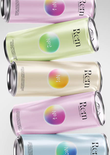
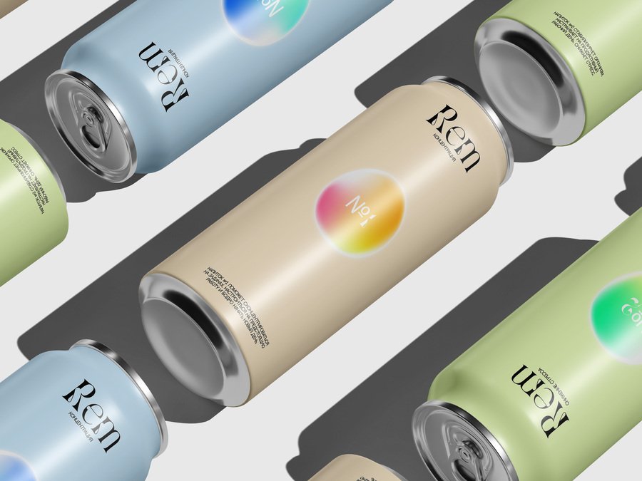
(Illustrator) The can design is our own creation.
The mockup for our cans were sourced from the Telegram channel «Jam Mockup.» Download link: https://t.me/jamfiles/3212
The mockup for our cans were sourced from the Telegram channel «Jam Mockup.» Download link: https://t.me/jamfiles/3907
The mockup for our cans were sourced from the Telegram channel «Jam Mockup.» Download link: https://t.me/jamfiles/6346
(Gemini // 12.12.2025) A young, diverse group of students or young professionals (one male, one female) are collaborating at a modern desk in a vibrant, slightly futuristic office setting. They are smiling and engaged, looking at a bright neon-green laptop. The room is stylishly lit with cyberpunk-inspired pink and green neon strip lights on shelves in the background, contrasting with the dark evening view outside the window. The mood is focused and collaborative. Cinematic composition, high-quality photograph, deep contrast, shallow depth of field, Include the attached can design in the image. (We submitted the prompt along with the design of our can, which we created ourselves.)
(Gemini // 12.12.2025) A close-up shot of a person’s tattooed arm and hand, wearing a dark hooded sweatshirt and silver chain accessory. The person has multiple silver rings on their fingers and their nails are painted black. The background is dark and moody with a neon pink/red vertical light source on the left, suggesting a night or club setting. There is a wispy, smoky or hazy effect in the foreground. The lighting is dramatic, highlighting the details of the hand and rings. Include the attached can design in the image. (We submitted the prompt along with the design of our can, which we created ourselves.)
(Gemini // 12.12.2025) A hyper-realistic photograph of two young programmers working late at night in a dimly lit, messy home office. A young woman with bright pink hair and glasses is slumped over her desk, clearly exhausted, resting her head on her hand while code is displayed on two large monitors in front of her. A young man is standing behind her, smiling warmly, offering her a glowing pink energy drink can. The desk is cluttered with empty energy drink cans, crumpled bags of chips, and scattered papers, emphasizing the long working hours. The scene should be dramatically lit with deep shadows and screen glow. Include the attached can design in the image. (We submitted the prompt along with the design of our can, which we created ourselves.)
(Gemini // 12.12.2025) Product photography of four sleek, modern beverage cans (330ml or 500ml) standing on a reflective black surface. The cans are colored pastel pink, light blue, soft green, and creamy beige. Each can features the brand name «Rem» and a centered, circular holographic or iridescent design with a number (№ 4, № 5, № 3, № 1). Soft, professional studio lighting emphasizes the can’s texture and reflection. Minimalist and clean aesthetic. Include the attached can design in the image. (We submitted the prompt along with the design of our can, which we created ourselves.)
(Gemini // 12.12.2025) A focused, professional man (designer/developer) with a neat beard is sitting in an ergonomic chair, working late at a desk in a dimly lit home office. He is wearing a dark casual shirt and looking intently at a large computer monitor displaying a clean, modern product website mockup. The website prominently features a 3D render of two sleek pastel-colored beverage cans (light blue and pink) against a soft gradient background. The room has dark blue walls, a white desk, and is illuminated by the bright light of two black desk lamps, creating a dramatic, focused atmosphere. The desk also has a speaker, mouse, keyboard, and a cup of colored pencils. Include the attached can design in the image. (We submitted the prompt along with the design of our can, which we created ourselves.)
(Gemini // 12.12.2025) A dynamic, atmospheric scene in a dark, slightly smoky or misty cafe or co-working space, with several groups of young adults sitting at dark wooden tables, engaged in conversation or working on laptops. The room has a moody, cool-toned blue and magenta lighting scheme, creating a dramatic and energetic atmosphere. Prominently displayed and centrally hanging from the ceiling is a large, vertical digital screen or banner showing a close-up of a sleek beverage can with the brand name «Rem» and a circular holographic element, set against a vibrant purple and pink gradient background. The digital display is bright and draws the eye, contrasting with the dark silhouettes of the people and the ambient lighting. The scene suggests a modern, urban nightlife or a late-night social/work setting. Include the attached can design in the image. (We submitted the prompt along with the design of our can, which we created ourselves.)
(Gemini // 12.12.2025) Three vertical, high-resolution digital art posters displayed side-by-side. Each poster features a soft, abstract color gradient background with a prominent grain or noise texture. The colors transition from teal/yellow (left) to magenta/pink (center) to bright blue/cyan (right). Centered on each poster is a short, motivational phrase rendered in a subtle, elegant serif font: «Reclaim your day,» «fuel your code,» and «find your focus.» A small number (N2, N4, N5) is placed at the bottom.


