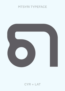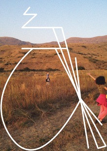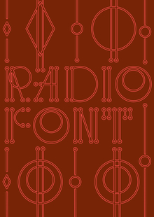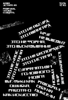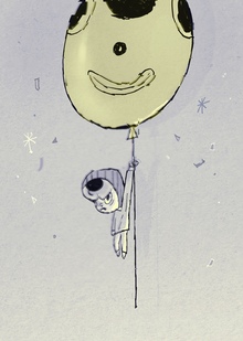
The typeface was inspired by the Russian folk tale, «Vasilisa the Beautiful.» The concept is based on the episode where Vasilisa is sorting grain.
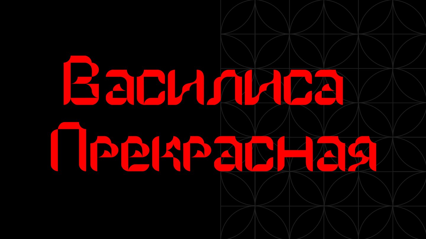
Original size 1920x1080
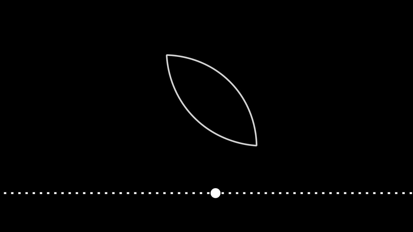
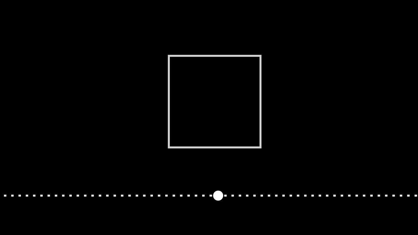
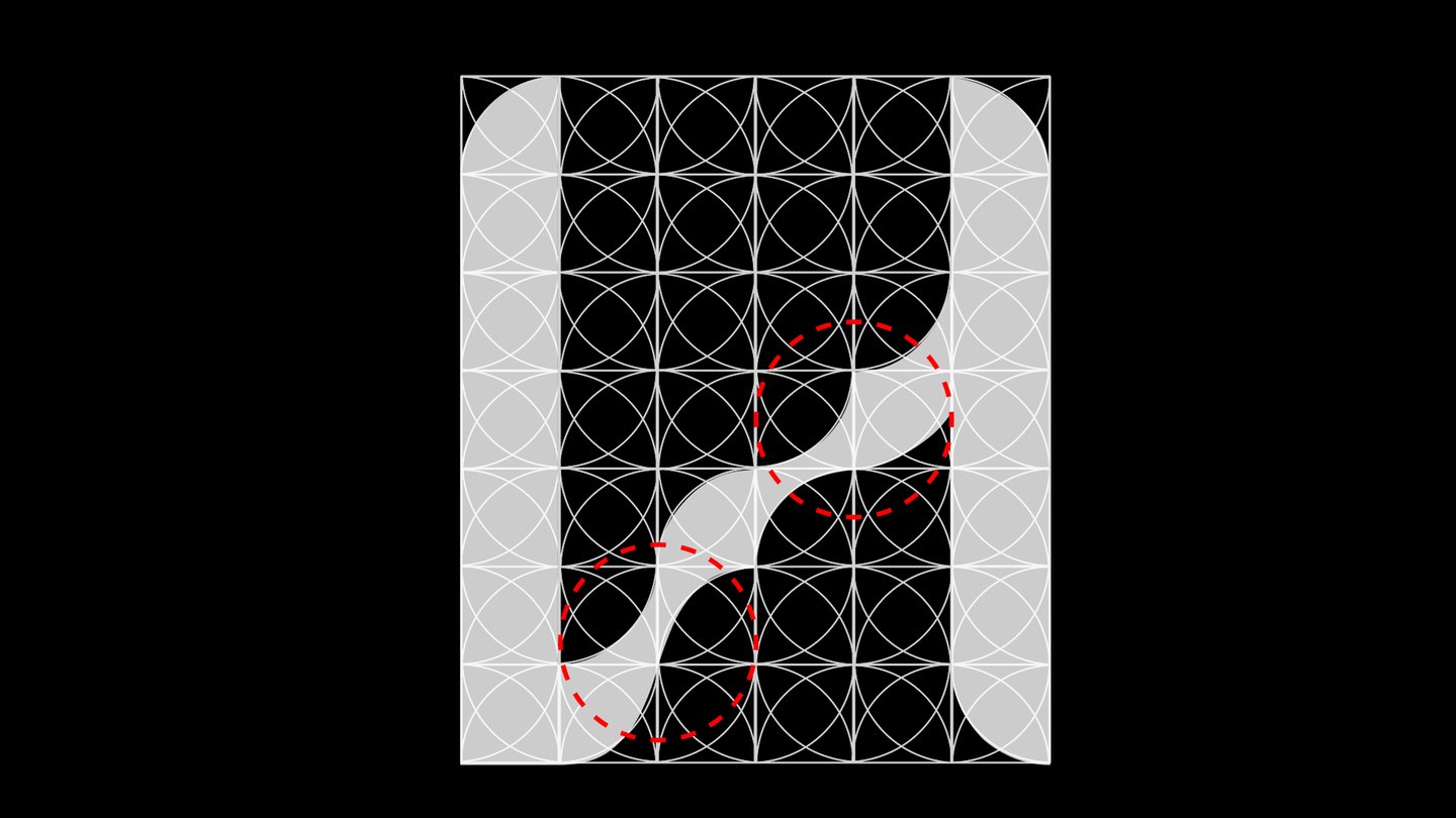
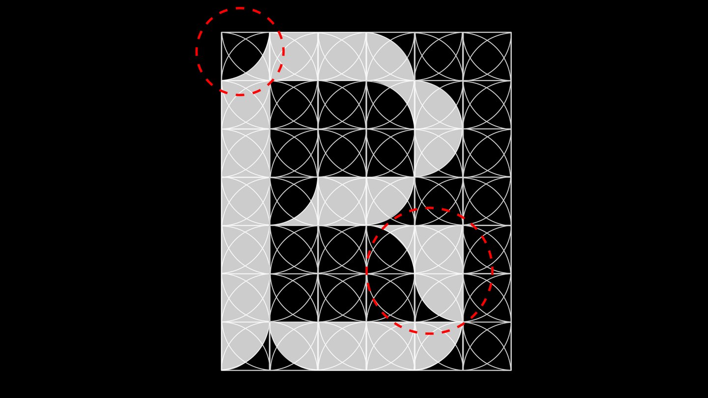
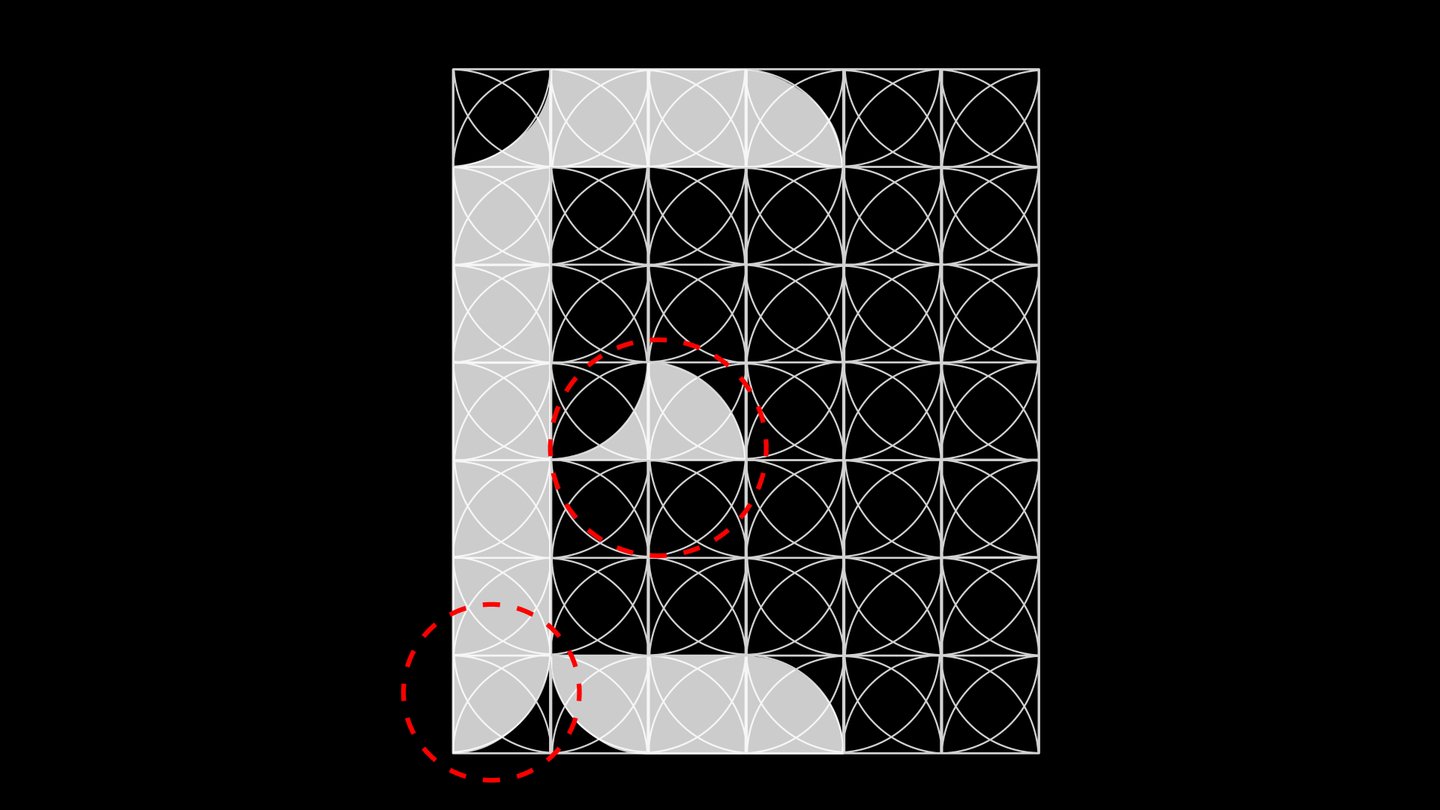
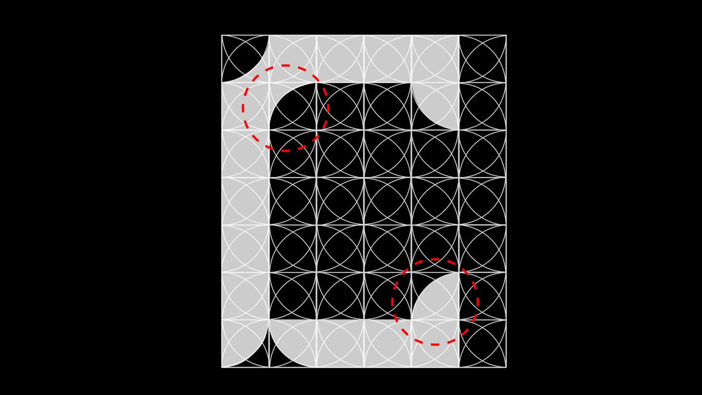
The image of a grain becomes a fundamental element of the typeface: a grid is formed from repeating shapes, upon which the letters are constructed.
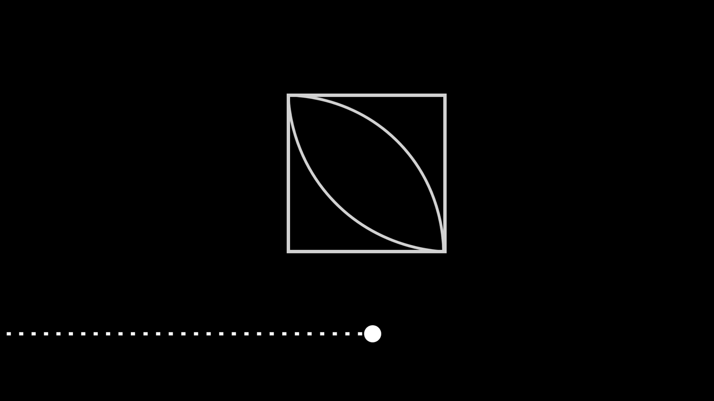
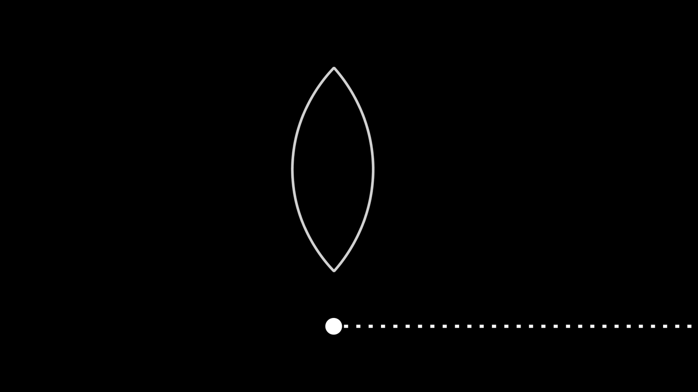
1/4
A grid was generated from the resulting module, which formed the basis for constructing the entire typeface.
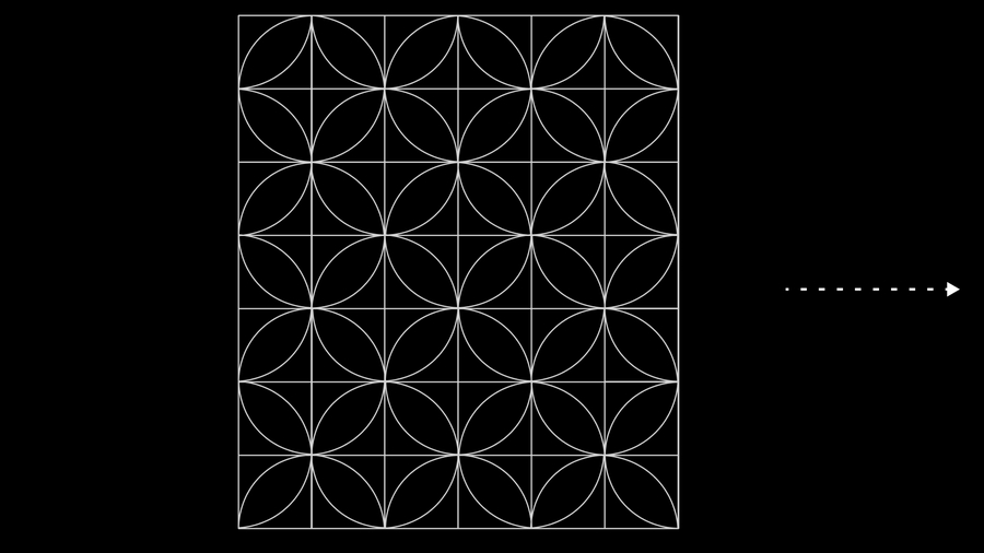
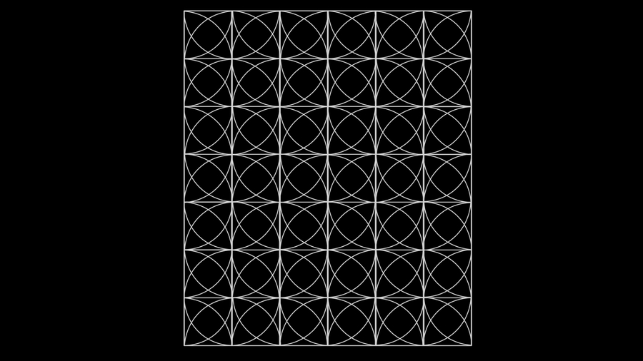
Grid Construction Process
1/4
Key recurring elements characteristic of the entire typeface.
Original size 1920x1080
Cyrillic
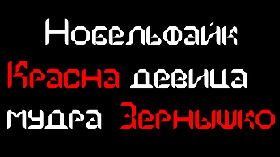
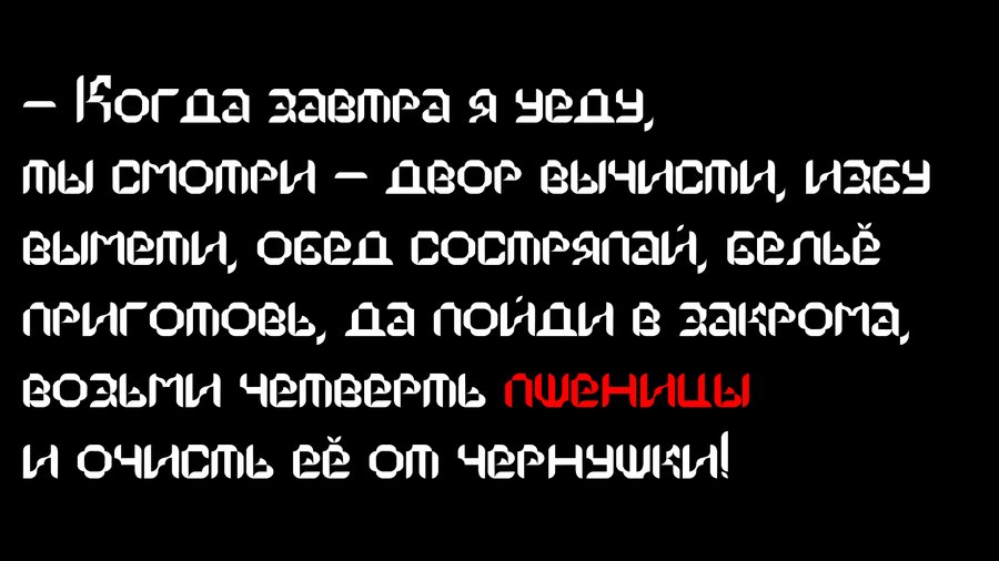
Original size 1920x1080
Latin alphabet
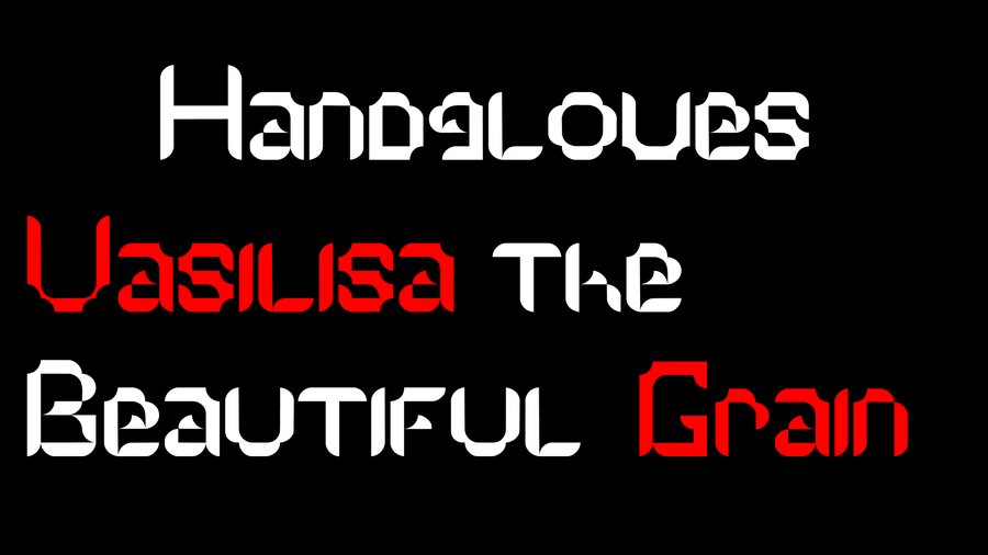
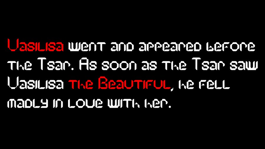
Original size 1920x1080
Numbers and Symbols
Original size 1920x1080
Postmarks
Original size 1920x1080
Matchbox
Original size 1920x1080
Wooden spoons. Right and left.
Original size 1920x1080
Grain sack
Original size 1920x1080
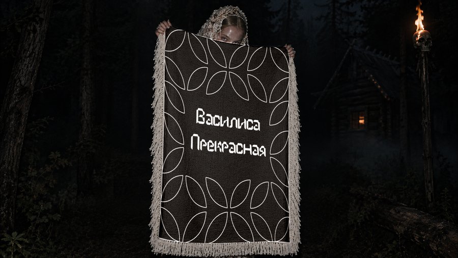
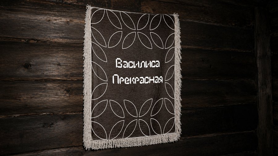
Tapestry. Factory.