Concept
Introduction to Culture
Imagine Ancient India in the 12th century, where sacred texts were inscribed on dried palm leaves—long, narrow, and extremely fragile. To preserve the manuscripts, cords were threaded through the leaves and protected with thick wooden covers. Thus, the palm-leaf codex became the central medium for two religions: Buddhism and Jainism.



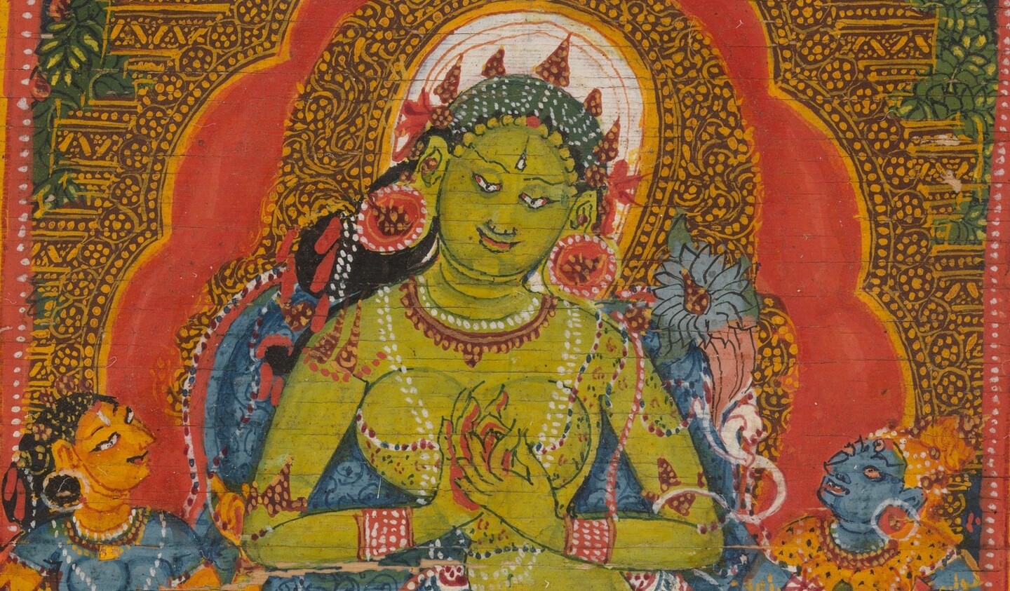
Furious Protector Mahakala, 12th century // Dancing Goddess-Woman, 12th century // Green Tara, 12th century
Indian miniature painting is a genre of painting that originated in India. Indian miniatures are distinguished by the abundance of detail that the artist places on a tiny canvas, as well as the characteristic meticulousness with which human, divine, and natural forms are depicted.



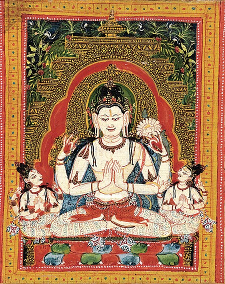
Avalokiteshvara, the Bodhisattva clarifying Dharma to the Devotee, early 12th century // Jain monk with a lay disciple, 1279 // Jain monk holding a flower venerated by a Royal Follower, 1279
About the Project
This project explores the similarities and differences between two traditions of Indian miniature painting from the 12th–14th centuries: Buddhist manuscripts from the Pala school and Jain manuscripts. Although both traditions employed the same format and similar mineral pigments, they developed two distinct visual languages.
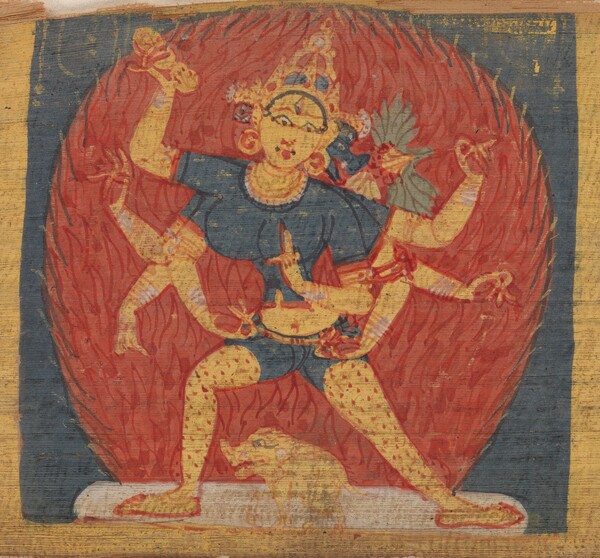
Furious eight-armed and three-faced goddess Tara Marichi, c. 1090 // Excerpts from the Ashtasahasrika Prajnaparamita Sutra, early 12th century
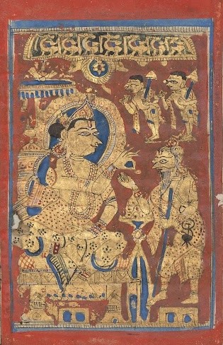
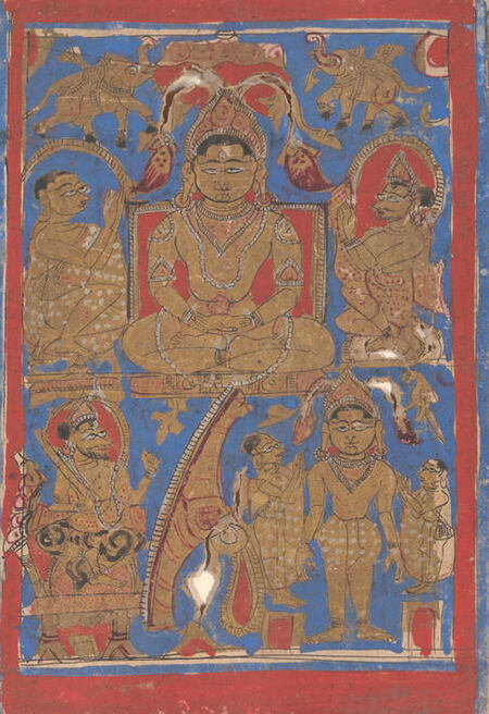
Miniature from the Kalpa Sutra, c. 1475–1500 // Miniature from the Kalpa Sutra, 15th century
Social Context
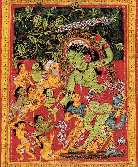
In the northeastern parts of India, Buddhist Pala manuscripts were created in large monasteries, supported by kings and nobility. Primarily, these manuscripts served to preserve, study, and disseminate Buddhist teachings. Their copying and veneration were regarded as pious acts that garnered religious merit.
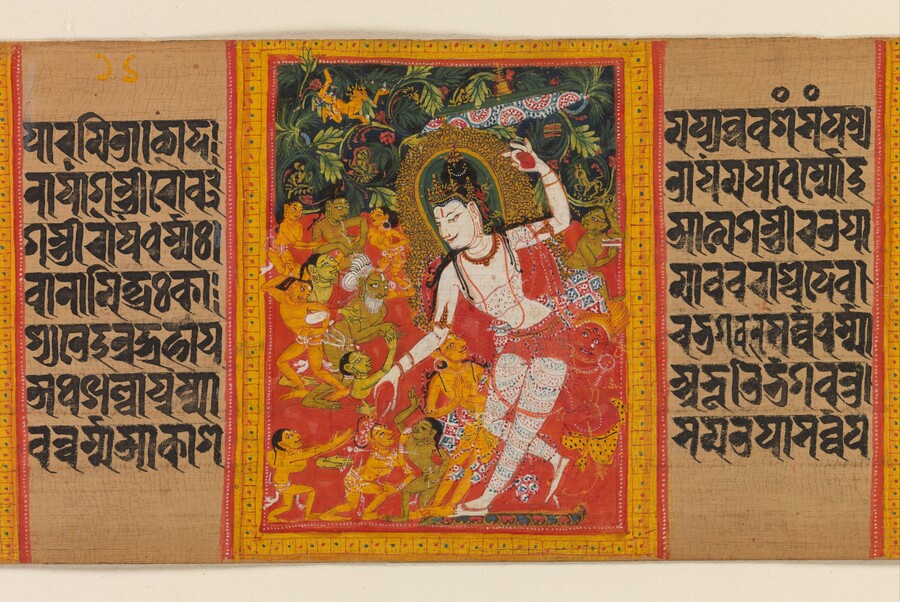
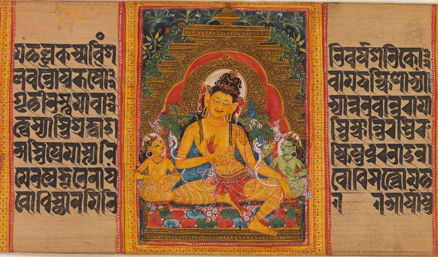
Bodhisattva Maitreya, early 12th century // Bodhisattva Avalokiteshvara giving gifts, early 12th century
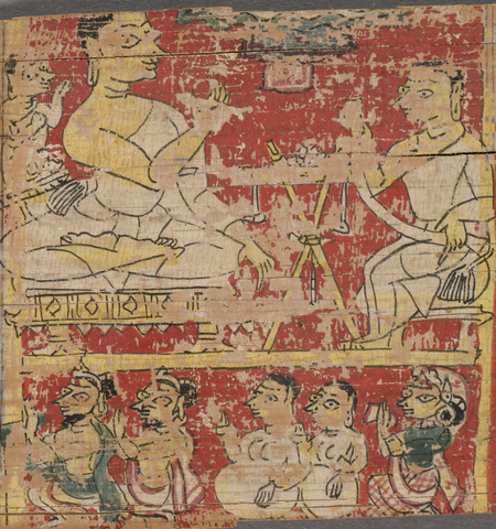
In the Jain communities of Western India, comprised of wealthy merchants, manuscripts served to preserve religious significance and strengthen community identity. For them, the book was a means to receive blessings and visually illustrate the lives of their saints.
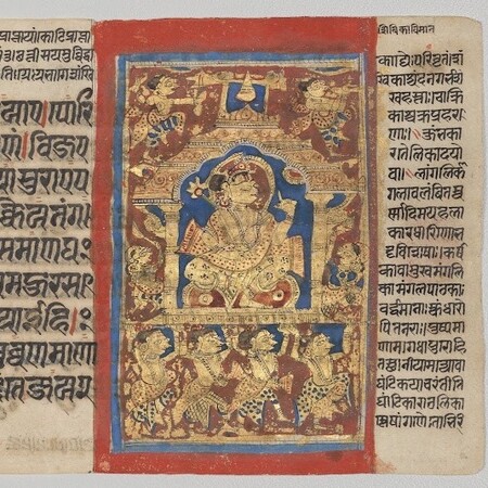
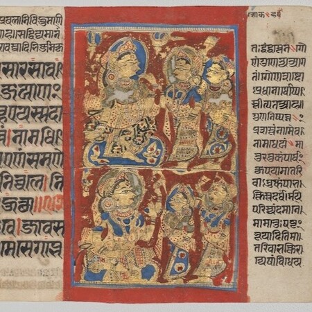
Miniature from Kalpa Sutra, c. 1475–1500 // Grief of Trishala, c. 1475–1500
The differing purposes for creating manuscripts initially determined distinct approaches to image-making.


Astasahasrika Prajnaparamita, circa 12th century
Analysis
Line Behavior
In Buddhist painting, the line used by Pala was smooth, fluid, and sinuous, gently outlining the contours of the body, shoulders, arms, and face. The line helped convey the plasticity of the human form, creating a sense of naturalness and movement, and becomes especially graceful and detailed in depictions of deities.
Buddha granting safety (Abhayānanda) to sailors, circa 1090
Bodhisattva Avalokiteshvara, teaching the Dharma to the devoted, early 12th century
Jain masters employed a different technique: their line is rigid and angular, emphasizing the boundaries of the body, face, clothing, and decorative elements; therefore, the contours of the figures are often more pronounced and noticeable.
Particular attention was also given to the clear separation of characters and space. The line was used to distinguish the figure from the background.
Jain monk with lay student, 1279
Monk with a flower in his hands, 1279
Color Palette
In the works of Buddhist monks, red, yellow, blue, green, white, and black were used. These colors could be vibrant, yet they combined quite harmoniously. Red and yellow backgrounds emphasized sacred figures. Shades of blue and green were employed in depictions of deities, clothing, and decorative details. Gold accents enhanced the feeling of preciousness and sacred status.
Color also helped distinguish the characters of the Buddhist pantheon and underscore their religious significance.
Dancing Goddess-woman releasing an arrow from a bow and holding an elephant goad, 12th century
In Jain art, bright red, dark blue, and ultramarine colors were widely used. Contrasting backgrounds helped to highlight the figures. Color areas were often applied flatly, without complex transitions or chiaroscuro modeling.
Color functioned as an independent expressive medium. It did not so much reproduce the natural environment as it made the image contrasting, decorative, and easily readable.